From Sketch to Radio: How We Turn a Venue Promo Idea into a Full Multi-Format Campaign
A venue campaign usually starts as a napkin-sized thought and ends as a small parade of files, proofs, mockups and one radio script that finally behaves. This walkthrough shows what happens in between, what we decide at each stage, and what you actually receive when one idea has to survive print, space and sound.
If you are planning a launch, promotion or seasonal push in Limassol or elsewhere in Cyprus, the usual questions arrive fast: How do we turn one offer into banners, brochures, plan visuals and a radio spot without making the whole thing look like five unrelated cousins at a wedding? How much detail should the first brief include? What gets decided early, and what can sensibly wait until review round two? The short answer is that the campaign needs one spine before it grows extra limbs.
For broader planning context, teams can compare guidance from web.dev guidance before choosing a workflow.
This article is a behind-the-scenes guide to that spine. I will walk through the studio workflow step by step, show the deliverables we build at each stage, explain the practical decisions hiding behind the pretty bits, and finish with a checklist you can use before you contact the studio. If you want the quick map first, our Services page shows the formats we cover and our Venue promotion system job detail shows how those campaign pieces come together in practice.

The principle: one campaign idea, many working formats
When a venue promotion works, the audience feels one clear message even though the studio may have produced ten different files. That unity does not happen because we repeat the same headline everywhere like a smoke alarm with ambitions. It happens because we define the core campaign idea early: the offer, the tone, the visual hierarchy, the practical constraints and the one thing people should remember after a quick glance or one listen.
For AMV Network Studio, that means every project begins with translation. The client often arrives with a goal in plain business language: fill tables for a themed night, drive attendance for an opening weekend, explain a venue layout to sponsors, or make a new package easy to promote across print and radio. Our job is to translate that into a campaign system that can live on a banner, inside a brochure, on a floor-plan rendering and inside a 20- or 30-second script without losing its point.
Related implementation details are also covered in MDN Web Docs, which helps keep tool decisions grounded in established practices.
If you are new to the process, it helps to think of the campaign as a stage production. The concept is the script, the formats are the actors, and each one needs blocking that suits the room. A banner cannot do the same job as a brochure. A floor-plan graphic cannot sound like a radio voice-over. But they can still behave like members of the same cast instead of improvising into chaos.
What happens first: brief, filters and the useful constraints
The first stage is not glamorous, which is exactly why it matters. We gather the information that decides the rest of the workflow:
- What is the venue, event or offer?
- What dates matter: launch date, print deadline, installation window, on-air start?
- Who is the audience, and what do they need to understand quickly?
- What formats are confirmed now, and which ones are likely to be added later?
- What physical or technical limits already exist: dimensions, bleed, site placement, runtime, supplier specs, language requirements?
Good constraints are not the enemy. They are the boring magic that keeps revision rounds from multiplying like rabbits with project management access. A venue banner with a fixed frame size immediately affects headline length. A brochure page count affects how much copy we can responsibly promise. A radio runtime changes the script rhythm. The earlier those facts arrive, the less guesswork we have to decorate later.
For clients in Limassol, this stage also often includes context that never appears in the final artwork but changes the design decisions underneath it: sunlight on an outdoor frontage, reading distance from a parking approach, bilingual audience needs, whether a brochure will be handed over in person or left on a counter, and whether a radio spot is meant to sound polished, urgent, playful or premium. Small details; large consequences.
Stage 1: the sketch phase, where the campaign learns to stand up
Once the brief is clear enough to work from, we sketch. Not because sketching is romantic. Mostly because it is fast, cheap and brutally honest. A weak concept can hide inside polished software for a surprisingly long time. On paper, it has nowhere to run.
At this stage we usually test three things:
- The main message hierarchy: what appears first, second and third.
- The visual emphasis: headline-led, image-led, offer-led or environment-led.
- The relationship between atmosphere and information.
For a venue promo, a sketch might define where the event name sits, how dominant the date should be, whether sponsor information stays quiet or prominent, and which lines can be shared across print and audio. This is also where we spot the classic client trap: trying to fit five campaigns into one rectangle. When every detail is important, nothing reads as important. The rectangle wins. It always wins.
The output here is usually a concept direction note, rough layout references and enough structure to move into real design. On our About page we describe this as practical production thinking. That phrase sounds tidy, but it really means we are already designing for the people who will later approve, print, install or broadcast the work.
Stage 2: layout system, brochure logic and visual consistency
Once the concept survives sketches, we build the layout system. This is where the campaign becomes less mood board and more machinery. We define the recurring elements that will travel between formats: type hierarchy, spacing rules, color emphasis, image treatment, icon logic and how promotional copy is shortened or expanded depending on the format.
Brochures are particularly useful here because they force clarity. A brochure spread cannot rely on sheer scale the way a banner can. It has to guide the eye through sections, support detailed reading and still feel related to the broader campaign. When we design brochure pages in the same workflow as banners and plan graphics, we are asking a helpful question: what is the essential visual grammar of this campaign?
The deliverables in this stage often include:
- A first-pass banner layout
- Brochure cover and spread concepts
- Typography and color direction
- Copy fit checks for short and long formats
- Review PDFs or presentation boards for client approval
This is also where we protect consistency without becoming mechanical. A campaign should look related, not cloned. The banner may be bold and compressed because it is seen from a distance. The brochure may open up with more breathing room. The floor-plan graphic may strip the style back so wayfinding stays readable. Same family, different jobs.
Stage 3: large-format banner mockups and floor-plan renderings
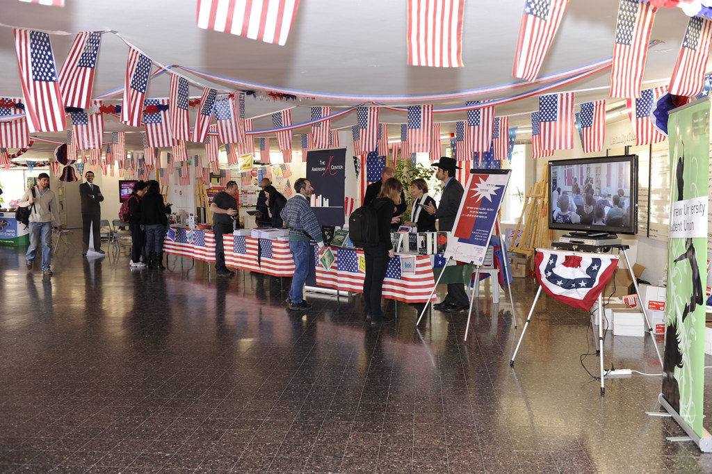
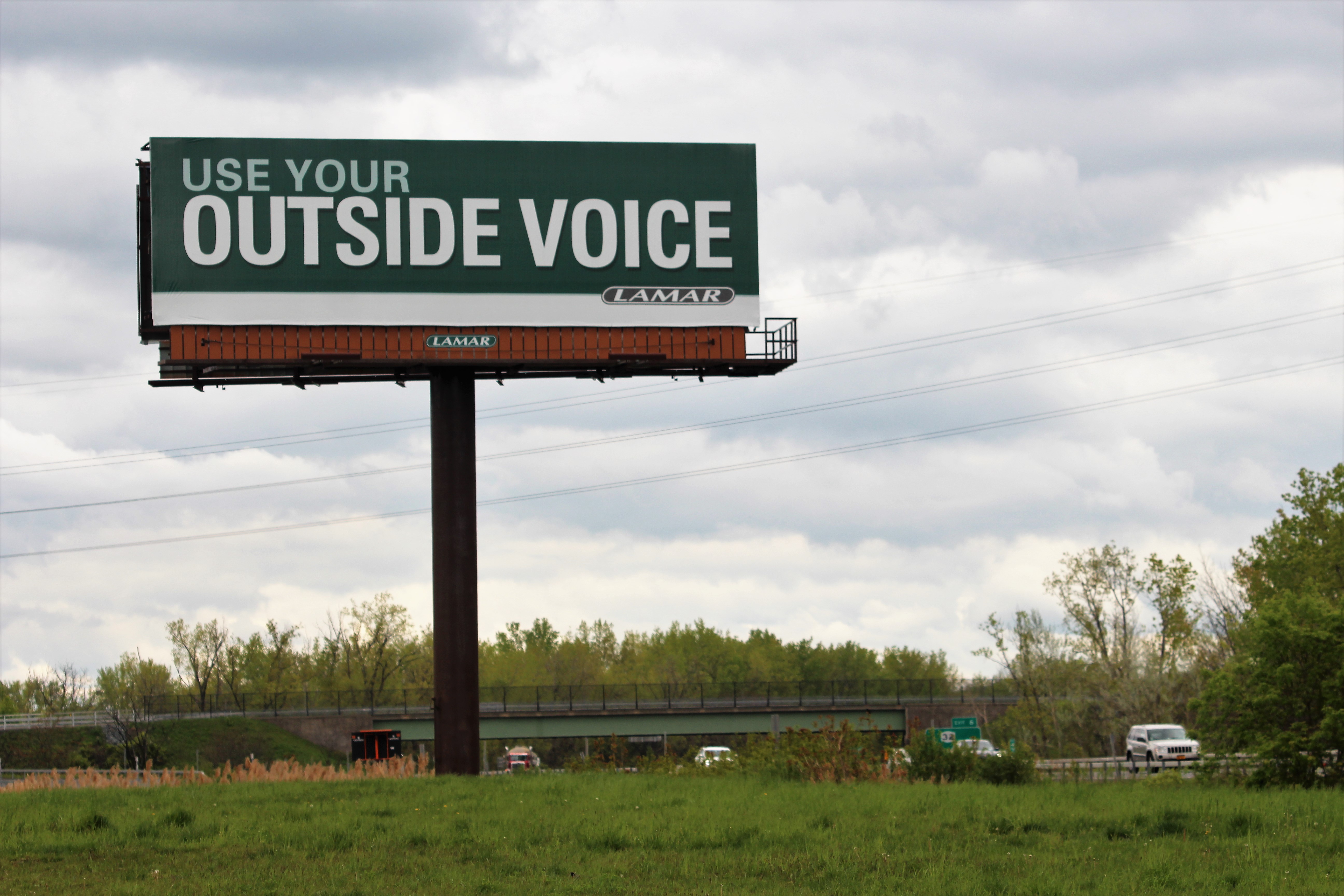
Now we move from design language to situational proof. A venue campaign is physical. It will live on facades, walls, counters, entry points and handouts. That means we do not just design artwork in isolation; we test how it behaves where people will actually meet it.
Banner mockups help us check scale, contrast and reading order. A line that looks elegant on a monitor can become invisible from six metres away. A logo that feels tasteful on a brochure might disappear completely on a crowded exterior. This is why mockups are useful: they let us catch ego problems before the printer becomes an unwilling therapist.
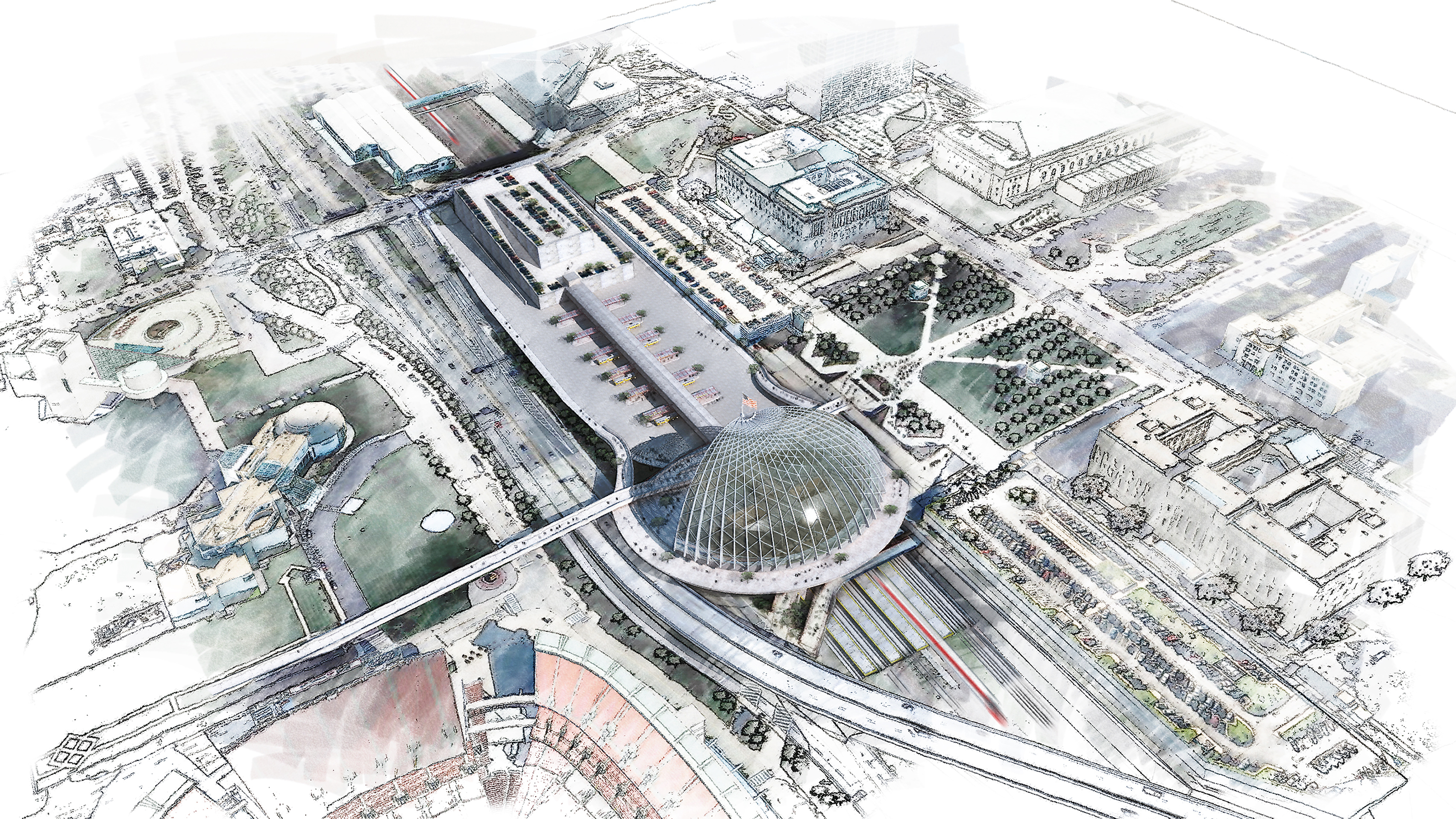
Floor-plan graphics and renderings solve a different problem. They help teams explain the space itself: entrance flows, sponsor placement, branded zones, table arrangements, directional signage or display logic. These visuals are often used internally as much as externally. Venue managers, partners and installers need a shared picture of what goes where. A clean rendering or annotated plan shortens that conversation dramatically.
If you look at the Venue promotion system and the rendering-focused examples on our portfolio page, you can see this overlap clearly: signage, presentation visuals and rollout planning are usually siblings, not separate planets.
Mini case example: venue banner + brochure + floor-plan graphic
Imagine a Limassol venue preparing a three-night summer series. The brief includes outdoor street-facing banners, a folded brochure for hotel desks and a floor-plan graphic for sponsors and internal staff.
Here is how that workflow usually breaks down:
- Banner: lead with the event series name, date window and one compelling offer. Keep reading distance in charge.
- Brochure: expand the story with programming, venue highlights, booking prompts and sponsor placement that does not hijack the page.
- Floor-plan graphic: simplify styling, prioritize orientation and clearly mark activity zones, branded touchpoints and traffic flow.
The point is not to make all three look identical. The point is to make them feel like the same event from three angles: attention, explanation and logistics.
Stage 4: radio script, voice-over direction and sound-ready export
Radio arrives later in the workflow for a reason. Once the visual hierarchy is working, we already know the message order, the tone and the non-negotiable details. That gives the script a clear job description instead of a vague mandate to “sound exciting,” which is how many ads end up sounding like a blender full of exclamation marks.
We typically write the radio spot by translating the visual system into spoken cadence. The banner headline becomes the opening hook. The supporting copy becomes the second beat. The call to action becomes the landing line. Then we shape the pace around the runtime and the audience context. A late-night venue teaser can lean atmospheric. A retail weekend push may need a cleaner, quicker delivery. A sponsor-heavy script needs ruthless compression or it starts tripping over its own shoes.
The deliverables here usually include:
- One or more script versions by runtime
- Voice direction notes: energy, pace, emphasis, gender preference if specified
- Pronunciation or brand-name notes when needed
- A final approved script for recording
- A sound-ready export or handoff package depending on production scope
Mini case example: radio script + VO direction + sound-ready export
Consider a venue relaunch campaign where the print materials already establish a clean, upscale tone. The radio version should not suddenly sound like a discount supermarket on espresso. So the script keeps the same promise but changes the mechanics:
- Hook: the venue name and event window arrive in the first line.
- Texture: voice direction stays confident and warm rather than frantic.
- Information discipline: only the details a listener can actually retain on one pass survive.
- Handoff: the final script is paired with VO notes and an export ready for the next production step.
That last step matters more than people expect. A beautiful script with fuzzy handoff notes creates interface friction for producers, voice talent and media buyers. A clean script package keeps the campaign moving.
Stage 5: review rounds, production prep and delivery pack
After the main formats are approved, we prepare the final package. This is the stage clients often underestimate because the visible creative decisions are mostly done. But production prep is where a campaign becomes usable rather than merely approved.
Depending on scope, the final handoff may include print-ready PDFs, supplier-safe exports, editable source packages, radio script files, placement visuals, plan graphics and naming conventions that stop everyone from sending “final-v3-last-really-final” into the group chat. Civilization depends on filenames more than we admit.
We also check the handoff against the actual rollout order. What needs to be printed first? What needs approval from venue management? What depends on confirmed dates or final sponsor logos? When campaigns extend into lightweight digital tools such as booking helpers, RSVP flows or internal briefing dashboards, we keep that scope separate and point teams toward the right build path, sometimes including an external web app builder if they need a fast product layer without slowing the core advertising rollout.
Typical timeline and deliverables
Every brief is different, but the workflow usually follows a recognisable sequence. The table below shows the practical rhythm rather than pretending every project moves at the speed of a fairy tale.
| Stage | What we decide | Typical deliverables | What the client should review |
|---|---|---|---|
| Brief and intake | Offer, audience, dates, dimensions, channels | Scope summary, reference gathering, format list | Missing specs, deadlines, mandatory copy |
| Concept and sketch | Main message hierarchy and visual direction | Rough sketches, concept notes, direction options | Preferred tone, strongest message, what to remove |
| Layout system | Typography, color logic, brochure structure, banner hierarchy | Layout comps, review PDFs, brochure pages | Readability, brand fit, content order |
| Spatial visuals | Placement, scale, wayfinding, rendering clarity | Banner mockups, floor-plan graphics, presentation visuals | Location accuracy, sponsor placement, approval needs |
| Radio production prep | Script rhythm, CTA, voice direction, runtime fit | Script versions, VO notes, final script package | Tone, legal phrasing if any, pronunciation, timing |
| Final delivery | Export settings, handoff order, file naming | Print-ready files, approved audio assets, final package | Supplier readiness and rollout schedule |
What clients receive, in plain language
By the time the project is ready for delivery, you are not just receiving “the design.” You are receiving a coordinated set of outputs built to reduce confusion for everyone who touches the campaign next. In practical terms that usually means:
- Approved banner or signage artwork sized for the intended placement
- Brochure pages or print collateral with clean hierarchy and supplier-ready setup
- Renderings or floor-plan graphics that explain placement and concept logic
- Radio scripts with direction notes rather than a lonely paragraph pretending to be a production plan
- A handoff package that supports printers, installers, venue teams or audio partners
That is the practical value of a multi-format workflow. Less chaos. Fewer mid-project identity crises. Better continuity between the thing people see on the street, the thing they pick up inside, and the thing they hear later on air.
How to brief us without writing a novel
You do not need a 14-page manifesto. You do need the right details. If you are preparing a brief for AMV Network Studio, this short list saves time immediately:
- Venue name: what is being promoted, and what should the audience call it?
- Dates: event date, launch date, installation deadline, print deadline, on-air timing.
- Offer: what is the central promise, hook or reason to act?
- Audience: who needs to notice this and what matters to them?
- Dimensions: banner sizes, brochure page count, placement context, radio runtime.
- Brand colors: existing palette, restrictions, or “please save us from beige” guidance.
- Voice preference: premium, energetic, conversational, playful, formal, local, bilingual.
If you have existing materials, add those too: logo files, prior campaigns, sponsor rules, floor plans, photography, venue measurements or any supplier specs already on hand. That does not make the brief fancier. It makes it usable.
Common friction points, and how we avoid them
The most common slowdown is not software. It is ambiguity pretending to be flexibility. Here are the usual trouble spots:
- Too many equal messages: we help rank them so the campaign has a lead voice.
- Missing dimensions: we ask for them early because layout without scale is decorative optimism.
- Late sponsor additions: we build layout systems that can absorb changes where possible.
- Radio details crammed at the end: we plan the script from the approved campaign logic, not as an afterthought.
- Handoff confusion: we package files with the next operator in mind.
That workflow is why a multi-format campaign can stay coherent even when the deliverables vary. One idea. Multiple formats. Fewer surprises with sharp corners.
The short version
A strong venue campaign does not jump straight from inspiration to “finished files.” It moves through a sequence: brief, sketch, layout system, banner mockups, brochure structure, floor-plan graphics, radio scripting and final handoff. Each stage solves a different problem. Each one makes the next stage faster and clearer.
If you already know your venue, dates and formats, the easiest next step is to send the essentials through our Contact page. If you are still shaping the scope, start with the Home page, compare the studio capabilities on Services, and browse the broader Portfolio and jump straight to the Venue promotion system job detail. We can take the campaign from first sketch to radio-ready handoff without making the process feel like a filing cabinet with stage fright.