Banners to Brochures: How to Reuse One Campaign Concept Across Formats Without Losing Consistency
If I had to boil the whole job down to one sentence, it would be this: a campaign stays coherent when the message gets fixed before the formats start improvising.
When someone asks for banners, brochures, a flyer, and a radio spot from one idea, the real questions are predictable: What stays the same? What gets cut? How do we keep the tone from wandering? And how do we stop the brochure from saying one thing while the banner says something slightly different and the radio script takes a scenic route?
The reason this gets messy is simple. Each format has its own rules. Adobe’s guidance on print document setup is a good reminder that output specs matter as soon as you leave a screen, while Nielsen Norman Group’s research on reading patterns explains why quick-scan layouts need a different hierarchy than long-form pages. Paul Rand said, “Design is the silent ambassador of your brand,” which is a tidy way of saying that consistency is not decoration; it is recognition. Adobe’s printing guidance and Nielsen Norman Group’s reading-pattern research are useful starting points if you want the reasoning behind the rule, not just the rule itself.
In this article, I will walk through a practical way to build one campaign idea and carry it across banners, flyers, brochures, and radio without redoing the whole thing each time. If you want the broader studio context while you read, the homepage, services, portfolio, and about pages give the wider picture. The contact page is there when the brief is ready, and the blog archive is the slower lane for more process notes.

Quick map: what stays fixed and what changes
The easiest way to avoid rework is to separate the campaign into two piles. One pile is fixed: the message, the offer, the tone, and the visual rules. The other pile is flexible: the size, the crop, the reading path, and the amount of copy each format can comfortably hold. If you mix those two piles, every format starts making its own little democracy, and that is how brands drift.
| Element | Keep fixed? | Allowed variation | Why it matters |
|---|---|---|---|
| Headline idea | Yes | Shorter or longer version, but same promise | Recognition starts with the core message |
| CTA | Yes | Format-aware wording, same action | The reader should not guess what to do next |
| Offer | Yes | May be phrased differently for audio or print | One offer, not three competing ones |
| Logo placement rule | Usually yes | May move slightly for layout or crop | People should find the brand fast |
| Color palette | Yes | Accent ratios can shift by format | Color is often the fastest recognition cue |
| Typography hierarchy | Yes | Point sizes, line breaks, and tracking may change | Hierarchy is what makes the idea readable |
| Photo style | Yes | Crop and framing change by format | Mixed photo styles make one campaign look like three different ones |
Think of that table as the campaign’s traffic light. Green items are stable. Yellow items can adapt. Red items should not change without reopening the brief.
Start with a single source of truth: the campaign message map
I like to start with one page that says what the campaign is actually trying to say. Not the mood board. Not the folder full of options. The message map. It is the plain version of the campaign, and it should fit on one page without requiring a fresh espresso and a decoder ring.
A useful message map usually includes five things:
- Headline: the main promise or idea.
- Offer: the concrete thing the reader or listener gets.
- Proof points: one to three reasons to believe the offer is real.
- CTA: the next action, stated plainly.
- Tone note: how the campaign should sound if you read it out loud.
Once that map exists, every format becomes an adaptation exercise instead of a reinvention exercise. That matters because reinvention is where copy changes, visual rhythm changes, and approval comments start multiplying like they have their own payroll.
| Message map field | Example of a stable version | How it adapts |
|---|---|---|
| Headline | “One idea, every format” | Short banner version, fuller brochure version, spoken radio version |
| Offer | “Multi-format campaign design support” | Can be simplified into “campaign design” or “print + radio campaign” |
| Proof points | “Clear hierarchy, matched tone, production-ready files” | Banner uses one proof point, brochure can use all three |
| CTA | “Book a review” | Can become “Call now,” “Visit the studio,” or “Send the brief” depending on format |
| Tone | “Confident, practical, and direct” | Remains the same even when the words change |
That map also helps with approvals. When a stakeholder asks for “a little more energy” or “something cleaner,” you can point to the actual field that needs adjusting instead of reopening the entire campaign. The difference is small in the moment and enormous by the second review.
Build a visual system that can travel
A campaign concept only feels unified if the visual system travels with it. That means you need a few rules that survive every output size. Not every pixel needs a rulebook, but the campaign should know where it lives.
The practical version of a visual system usually covers four things:
- Logo rules: clear space, minimum size, and whether the mark sits top left, bottom right, or in a fixed footer block.
- Color usage: primary brand color, supporting neutrals, and one or two accent colors that do not compete with the headline.
- Typography hierarchy: which typeface handles headlines, which handles body copy, and how much emphasis each level gets.
- Photo style: whether the campaign uses people, products, textures, illustrations, or a mix, and how that style is cropped.
The important part is not just choosing those elements. It is deciding how they are allowed to behave. A banner might need a giant headline and almost no body copy. A brochure might need more breathing room and section labels. A flyer might need stronger contrast because it will probably be read while someone is already standing up and halfway distracted. The same palette can still look like the same campaign if the hierarchy is disciplined.
If you want a second external reference point here, AIGA’s agreement guidance is a helpful reminder that design work gets cleaner when decisions, expectations, and deliverables are written down before the job starts. The language is about contracts, but the lesson maps neatly to visual systems too: define the rules early, and the project becomes easier to steer. AIGA’s design agreement resource is worth a look for that reason alone.
Create master layout logic before you start resizing everything
Master layout logic is the skeleton. It is the order in which the campaign speaks, regardless of format. If the skeleton changes every time you resize the canvas, the campaign is not adaptable; it is just unstable.
For most multi-format campaigns, I treat the layout as a set of fixed and variable components:
| Component | Fixed or variable? | Example rule |
|---|---|---|
| Brand anchor | Fixed | Logo sits in one of two approved corners |
| Hero message | Fixed | The main idea always appears first or second in the reading path |
| Offer line | Fixed | The same promise appears in every format, even if phrasing changes slightly |
| Support copy | Variable | Print can carry more detail than a banner; radio can carry even less but speak it more clearly |
| Image crop | Variable | The same photo can become a wide banner crop, a vertical flyer crop, or a brochure cover crop |
| CTA format | Variable | Audio needs a spoken line; print needs a visible one; brochure may use both |
This is also where a campaign earns its efficiency. Once the skeleton is approved, each new format is mostly a matter of translation. You are not asking, “What do we make?” every time. You are asking, “How does this same message live in this format?” That is a much calmer question, and the answer is usually better.
Format adaptations: same campaign, different reading behavior
Banner hierarchy: one glance, one message
Banners usually get the shortest attention span in the whole campaign. That is not a flaw; it is the medium. People see them while moving, parking, waiting, or glancing across a distance. So the banner has one job: get the main idea across before the eye moves on.
For banner hierarchy, I usually keep the structure brutally simple:
- Headline first. It should be large enough to survive distance and lighting.
- Offer second. This is the one detail that helps the reader decide whether the banner matters.
- CTA third. Keep it short and visible. If the banner needs a QR code, treat it as support, not as the whole plan.
- Brand anchor last. The logo should confirm the source, not fight the message.
A bad banner tries to say everything. A good banner says one thing clearly and lets the rest of the campaign do the explaining. The trick is not more words. The trick is fewer words in a better order.
Flyer scan patterns: design for the way people actually skim
Flyers live in a different world. They are still quick, but they are not as fast as banners. A flyer may be picked up, turned over, stacked, or scanned while someone stands near a desk or counter. That means you can use more copy than a banner, but only if the hierarchy is clean enough for a reader to find the important bits in a glance.
Here is the simplest flyer scan pattern I know:
- Top: headline and main benefit.
- Middle: short supporting bullets or proof points.
- Bottom: CTA, contact details, and any practical next step.
Use one dominant image or one strong focal block, not three competing ones. If everything is emphasized, nothing is emphasized, which is a frustrating way to spend perfectly good ink. Keep the body copy bite-sized and use bullets where the eye needs relief. Flyers do not need to be tiny novels. They need to be readable without being precious about it.
Nielsen Norman Group’s work on reading patterns is useful here because it explains a reality that designers already feel in their bones: people scan before they read. Once you accept that, flyer design stops looking like a space-filling problem and starts looking like a sequence problem. The F-pattern research is not about flyers specifically, but the core lesson transfers cleanly.
Brochure grid and fold flow: make the path feel obvious
Brochures are where a campaign can either feel polished or become a maze. A brochure has the luxury of space, but it also has the danger of overexplaining itself. The answer is not to pack in everything you can think of. The answer is to give the reader a path.
A good brochure flow usually looks something like this:
- Front cover: one idea, one image, one invitation to keep going.
- Inside spread: the main explanation and the proof points.
- Final panel: contact information, CTA, and any practical next step.
Brochures work best when the fold is treated as a transition, not just a technical line. The reader should feel pulled from one section to the next. If the layout has a useful rhythm, the brochure can carry more detail without feeling heavy. If the rhythm is off, even a short brochure can feel overstuffed.
This is a good place to check your visual system again. Does the brochure still look like the same campaign if the banner image is cropped tighter? Does the type hierarchy still make sense if the headline gets longer? Does the CTA still sound like the same campaign voice? If the answer is no, the brochure is not adapting yet; it is drifting.
Radio consistency: the visual CTA and the spoken CTA should match
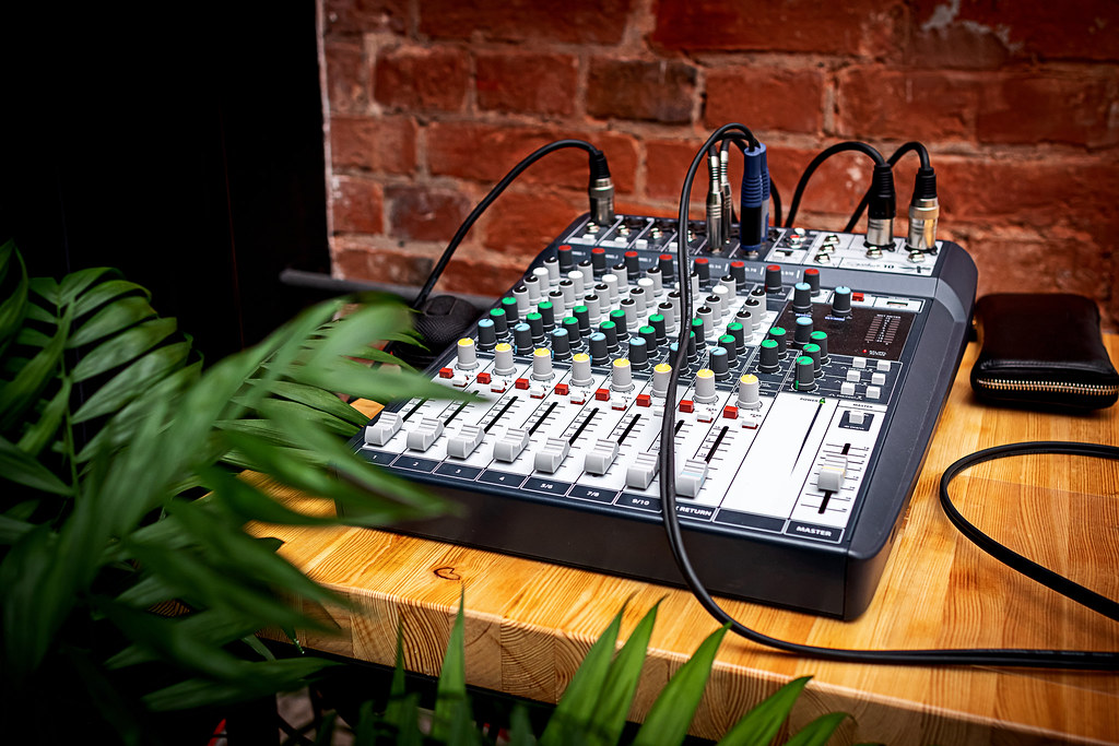
Radio is the easiest place for a campaign to lose itself, because there is no logo, no color palette, and no layout to keep the message honest. All you have is language, timing, and tone. That means the spoken script has to stay in step with the visual campaign instead of wandering off to invent a second personality.
The simplest rule is this: if the banner says one thing, the radio spot should not say something slightly different just because someone thought it sounded smoother. The CTA should match. The offer should match. The level of urgency should match. A listener should feel like the audio and print were written by the same brain on the same day.
For example, if the visual campaign says “Book a review this week,” do not turn the radio version into “Call us whenever you are ready to talk.” That sounds harmless, but it changes the energy. One version asks for action now. The other version strolls to the curb and waits to see what happens.
Useful radio consistency checks:
- Match the CTA language. Keep the action word the same whenever possible.
- Match the offer wording. Do not rename the offer in every format.
- Match the tone. If the visuals are direct and practical, the script should not become theatrical.
- Match the proof points. Use the same claim set, even if the order changes.
If you want a plain-language resource on the usage side of audio or print assets, the U.S. Copyright Office overview of copyright basics is a sensible reference. It is not glamorous, but it keeps rights questions from showing up at the worst possible moment. The Copyright Office’s copyright basics guide is a practical background link if rights and reuse are part of the project.
Production realities: file versions, naming, and approval checkpoints
This is the part people underestimate because it does not sound creative. It is still one of the most important parts of the entire campaign. Once the message, visuals, and script are agreed, production either keeps the campaign coherent or lets it wobble at the finish line.
I like to think in three production habits:
- Version names that make sense. No one should have to open six files to discover which one is final.
- Approval checkpoints that are visible. There should be a clear moment for message approval, layout approval, and final export approval.
- Handoff notes that are short but specific. The printer, editor, or installer should not need to decode your mood.
A good naming convention often looks boring, and that is a compliment. Something like this is enough:
campaignname_banner_1200x300_v01.pdf
campaignname_flyer_a4_v02.pdf
campaignname_brochure_6pp_v03.pdf
campaignname_radio_30s_v04.wav
The point is not to make the filenames clever. The point is to make them searchable, sortable, and impossible to confuse when the deadline is doing its usual little sprint.
For teams that are also trying to figure out where automation or AI fits in approvals, handoffs, or version tracking, a neutral overview of AI consulting services can be a practical way to map the first pilot before changing the creative workflow. It should stay in the background and help define the process, not become the campaign itself.
If the project includes usage terms or handoff rules, this is also where a quick check of the Creative Commons Attribution 4.0 license can be useful as a plain-language reminder that reuse rights should be explicit, not assumed. The exact license will vary by job, of course, but the habit of naming rights clearly is what matters here.
Common failure modes
Most multi-format campaign mistakes are not mysterious. They are just easy to repeat under pressure. The good news is that they are also easy to spot if you know what to look for.
| Failure mode | What it looks like | How to fix it |
|---|---|---|
| Inconsistent CTA | Banner says one thing, brochure says another, radio spot says a third | Approve one action phrase and adapt it, do not replace it |
| Unreadable banner type | Too much copy, weak contrast, or a font size that only works on a laptop | Cut the copy and increase hierarchy instead of squeezing harder |
| Brochure overload | Every panel tries to become a homepage | Give the brochure one job per panel and trim the rest |
| Mismatched tone | Visuals feel practical, audio feels playful, copy feels formal | Write one tone note and apply it in every format review |
| Version chaos | Final_final_really_final files with no clear approval trail | Use a naming convention and lock checkpoints before export |
| Late offer changes | The headline is approved, then the offer changes and everything shifts | Freeze the message map before layout work gets too far |
The theme running through all of these is the same: inconsistency tends to start small, then spread. One changed word can require three layout edits and one audio rewrite. One new crop can force a new hierarchy. One unclear approval can cost more time than the original design did.
A simple reuse checklist before you export and send to production
Before anything leaves the studio, I like a last pass that checks the campaign against its own rules. Not because perfection is possible, but because the first export should not be the place where the project discovers it has a personality disorder.
- Does every format use the same headline idea?
- Does every format keep the same offer, even if the wording changes a little?
- Does the CTA point to the same action across banner, brochure, flyer, and radio?
- Does the color palette stay inside the approved system?
- Does the type hierarchy still feel like the same campaign in each size?
- Does the photo style look consistent when the crop changes?
- Does the banner stay readable at a distance?
- Does the flyer scan cleanly from top to bottom?
- Does the brochure fold flow feel obvious?
- Does the radio script match the visual tone and CTA?
- Are file names, versions, and export notes easy to follow?
- Has every required approval been collected before final delivery?
If the answer to even one of those is no, I would pause and fix the issue before production. That is not delay for delay’s sake. That is how you avoid a small inconsistency becoming the story everyone remembers for the wrong reason.
Why this approach saves work later
The real benefit of a reusable campaign concept is not just efficiency, although that is nice. The bigger win is clarity. Once the message map is fixed, the visual system is written down, and the layout logic is approved, every format has fewer opportunities to drift. That means fewer revision loops, fewer “can we just change this one thing” emails, and fewer awkward moments where the banner, flyer, and radio spot all sound like they attended different meetings.
There is also a trust benefit. A campaign that feels consistent tends to feel more intentional, and intentional work usually reads as more credible. People do not always know why a message feels stronger, but they can feel when the parts belong to each other. That is the quiet power of format discipline.
If you want another way to think about it, the campaign is the sentence and the formats are the accents. The sentence should stay the same. The accents can change, but they should never change the meaning.
Conclusion
Reusing one campaign concept across banners, brochures, flyers, and radio is not about forcing every format to look identical. It is about protecting the idea while letting each medium do its own job. Start with a message map, define the visual system, approve the layout logic, and then adapt the copy and hierarchy to fit the format instead of starting over every time.
If you want help turning one campaign idea into a consistent set of deliverables, the easiest next step is to review the services page, look at the portfolio for examples of how the studio handles different formats, and use the contact page when you are ready to brief the job. The blog archive has more process notes if you want to keep going.
Key points to remember:
- Fix the message before you resize the design.
- Use one message map for every format.
- Keep the visual system consistent even when the layout changes.
- Match the radio script to the visual CTA and offer language.
- Check file versions, approvals, and handoff notes before production.
That is the plain version. Once the campaign knows what it is, the formats stop fighting it and start carrying it.