5 Questions to Choose the Right Banner Size for Any Display
If you have ever stood in front of a blank wall, a roadside fence, or a foyer entrance and wondered, “How big should this banner actually be?” you are already asking the right question.
Should this be 3×8 or 4×12? Will people read it from the parking lot? Do I need one large banner or a few smaller ones? And how much text is too much before the whole thing starts feeling like a very expensive weather report?
The short version is that banner size is not a decoration choice. It is a readability choice. The W3C contrast guidance and Nielsen Norman Group’s legibility guidance both point to the same plain truth: if people cannot see and process the message quickly, the design has already missed its first job. That is why banner size, contrast, and message length have to be decided together, not in separate little silos that politely ignore each other.
In this guide, I will give you a practical way to choose a banner size for a venue entrance, roadside display, or indoor setup. You will learn the terms, compare common placements, decide when to go big or split the message, and walk away with a short checklist you can use before ordering. If you want to see how these choices show up in real studio work, the portfolio has a few helpful examples, and the services page shows the kind of banner and print support this studio offers.
By Nora Finch · Updated July 26, 2026
Quick definitions before we size anything
Banner talk gets confusing fast because people use the same words to mean different things. I like to start with a plain version of the basics so the rest of the decision is easier to follow.
| Term | Plain version | Why it matters |
|---|---|---|
| Finished size | The final banner dimensions after production | This is the number you order, hang, and measure against the wall |
| Viewing distance | How far away a typical reader will be | Farther away usually means larger text, fewer words, and simpler layout |
| Sightline | The path between the reader’s eyes and the banner | People may see the banner early, late, or only from one angle |
| Safe zone | The area where important text stays away from edges | Critical words should not sit where hems, grommets, or trimming can interfere |
| Bleed | Extra artwork past the trim edge | It helps avoid thin white edges if the banner is cut slightly off-center |
| Orientation | Horizontal or vertical layout | The shape should fit the wall, fence, or stand before the copy is written |
| Copy density | How much information is packed into the banner | More dense copy needs more close viewing; less dense copy works at distance |
If you remember only one thing from this section, make it this: banner size is really “message size in the real world.”
1. How placement changes the ideal size
The first question I ask is not “What size sounds normal?” It is “Where will this banner live?” A banner over a venue entrance behaves differently from one beside a road or tucked inside a lobby. Placement changes both the physical space and the way the viewer moves past the message.
A venue entrance banner is usually read by people who are already arriving. They may be walking, parking, or looking for the door, so the banner needs a clear headline and very little clutter. A roadside banner has to fight more distance, speed, and visual noise. An indoor banner can often hold a little more detail because the audience stands closer and stays longer.
Here is the simplest way to think about it: the further the viewer is from the banner, the larger the banner and the shorter the message should usually be.
| Placement | What the reader is doing | What usually works best | Practical example |
|---|---|---|---|
| Venue entrance | Arriving, checking the door, slowing down | A clear headline, one supporting line, visible branding | “Summer Open Day” plus date, arrow, and logo |
| Roadside | Driving or passing quickly | Large type, high contrast, very short copy | Brand name + one call to action like “Turn Here” |
| Indoor lobby | Standing, waiting, reading up close | Smaller text, more detail, stronger visual hierarchy | Event title, schedule highlights, and sponsor line |
| Registration or queue area | Pausing briefly and looking for instructions | Simple steps, arrows, and short operational notes | “Check in here,” “Have your ticket ready,” “Ask for help” |
That is also where a simple layout map helps. The screenshot below is not there to make the article look busy. It is there because a map answers a question that words sometimes overcomplicate: where does the banner actually sit in the space?
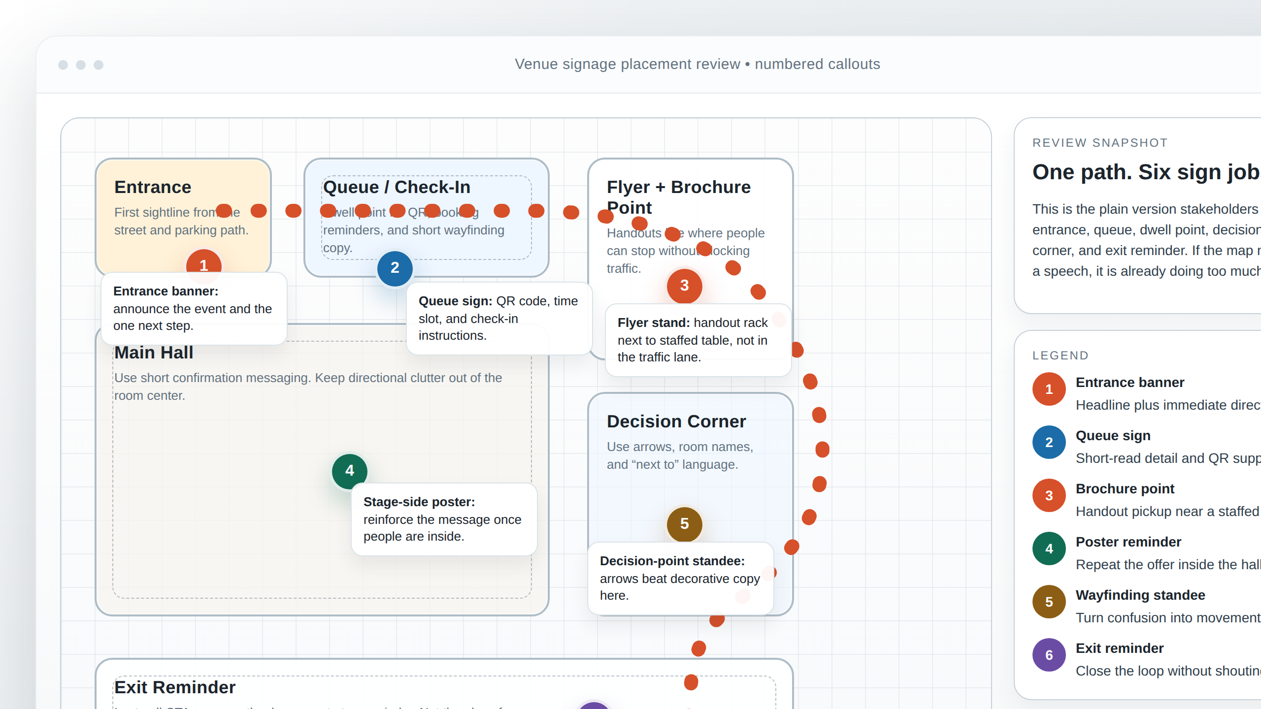
One practical example: if the banner sits above a venue entrance, the width matters more than the height because the eye reads the span of the opening first. If the banner is placed along a fence at the roadside, you may want a wider format with a very short message. If it hangs in a hall near a registration desk, the size can be slightly smaller because people are closer, but the layout still needs to stay clean. A banner that is too small for the location looks tentative. A banner that is too large for the location can feel like it is trying to win an argument with the building.
When the space is awkward, I like to sketch the wall, note where people enter from, and mark the first point where they can really read the sign. That single step often tells you more than any generic size chart.
2. Viewing distance and message length
Viewing distance is the quiet rule behind almost every good banner decision. The closer the viewer is, the more detail you can reasonably include. The farther they are, the more the design has to act like a billboard: bold, fast, and simple. If the viewer has to squint, stop, or reverse course to understand the message, the banner has already asked too much of them.
This is where people often make the same mistake twice. First they choose a banner size based on the wall. Then they fill it with enough words to make the size useless. The result is technically a banner, but practically a very large memo.
The practical fix is to match message length to viewing distance. A roadside banner may only deserve a brand name and one action. A venue entrance banner can hold the event name, date, and maybe a single supporting line. An indoor display can carry a little more nuance, especially if people are already inside and willing to read.
For a broader sizing reference, the Banners.com size guide and the companion article on how far away someone can read a banner are useful because they keep the conversation grounded in real placement, not abstract design wishes. I also keep WCAG contrast guidance close by when I am checking whether text can hold up at a distance, and Nielsen Norman Group’s legibility overview is a good reminder that seeing words and processing words are not the same thing.
Here is a loose, practical way to think about copy length:
- Short distance means you can include more words, but only if the reader has time to stop and read.
- Medium distance usually calls for a headline, a short supporting line, and a single call to action.
- Long distance usually wants brand name + one idea + high contrast.
Example one: a roadside banner for a venue opening might say “Grand Opening This Saturday” with a single arrow and the venue name. That is enough. Example two: an indoor banner in a foyer might say “Welcome to the Annual Design Forum” and add the day’s theme, because guests are already standing in one place. Example three: a large banner inside a hall might carry sponsor recognition and direction details, because the audience is not just glancing; they are navigating.
If you are tempted to add a second paragraph, that is usually the moment to ask whether a brochure, flyer, or separate sign would do the job better.
3. Indoor vs. outdoor considerations
Indoor and outdoor banners are cousins, not twins. They may share a layout language, but they face different realities. Outdoors, the banner has to survive wind, glare, weather, and a wider reading distance. Indoors, the banner is often closer to the viewer, but it also competes with lighting, people, furniture, and the general chaos of a real event space.
That means the ideal size is never just about how much wall you have. It is also about how the environment affects the message. A banner that looks perfect in a clean mockup can become too small once it is mounted above a bright doorway or across a sunlit frontage.
Outdoor displays usually benefit from:
- larger type and fewer words,
- strong contrast,
- simple imagery,
- enough physical size to hold up from a distance, and
- a mounting plan that keeps the banner stable and readable.
Indoor displays usually benefit from:
- a slightly more flexible copy length,
- clear hierarchy between headline and support text,
- clean alignment with walls, counters, or stage lines, and
- enough size to stay legible without crowding the room.
This is where the difference between a good idea and a good banner becomes obvious. A good idea says, “We should announce the event.” A good banner says, “We should announce it in a way people can read from the right place, in the right light, without having to decode the thing like a treasure map.”
If you are not sure which environment matters more, the safest approach is to design for the harder one. Outdoor legibility is usually the stricter test, and indoor displays can often be refined once the size is already clear.
For teams that need help matching a banner to a bigger venue setup, the About page gives a better sense of the studio’s approach, and the services page is the place to start if the project needs custom sizing or layout support.
4. One large banner or several smaller ones?
This is one of those decisions that sounds aesthetic but is really logistical. A single large banner makes one strong statement. Several smaller banners spread the message across a space and let each sign do a narrower job. Neither choice is automatically better. It depends on the path people take through the venue.
I like to ask a simple question: Is the visitor supposed to notice one idea, or move through several moments? If it is one idea, a large banner often works best. If the space has stages, turns, queues, or separate zones, smaller banners often make more sense because the message can change at each point.
Choose one large banner when:
- there is one main entrance or one focal wall,
- the audience gets only one clean viewing angle,
- the message is short and memorable, and
- you want the space to feel anchored by a single visual statement.
Choose multiple smaller banners when:
- people move through different zones,
- the venue needs direction signs as well as promotional signs,
- the message changes by location, or
- the layout would feel overloaded if everything were squeezed into one sheet.
Here is a useful example. A venue entrance might need one banner that announces the event. Inside the hall, a smaller banner can repeat the theme near the registration point. Further in, a poster or stand can give the schedule or direct guests to the next zone. The space is doing the work, and the signs are supporting it rather than all shouting at once.
This is also where a quick floor-plan sketch pays for itself. If you can mark the entry, queue, decision point, and exit, you can usually tell whether one large banner is enough or whether the space needs several smaller ones. In my experience, the right answer often becomes obvious the moment you draw the visitor path instead of staring at the wall in heroic silence.
If you want to compare how different formats work across a real campaign, the portfolio examples make the “one big piece versus several smaller ones” decision easier to picture.
5. Questions to ask before ordering
Before anyone starts exporting artwork, I like to run through a short checklist. It saves time, reduces guesswork, and keeps the final banner tied to an actual purpose instead of a vaguely impressive rectangle.
These are the questions I would ask:
- What is the primary message? If the banner had room for only one idea, what should it say?
- Where will it be displayed? Entrance, roadside, lobby, queue area, stage, or something else?
- How far away will people be? Standing close, walking past, or seeing it from a vehicle?
- How long will they have to read it? Three seconds and moving, or ten seconds and waiting?
- Is this one banner or a family of signs? Sometimes the best answer is not larger size but more than one piece.
- What needs to be visible at a glance? Usually the event name, brand, date, and one call to action.
- What can be removed without losing meaning? This is the question that saves the layout from clutter.
- Do the final files match the hanging plan? Horizontal artwork should not sneak onto a vertical frame and pretend it belongs there.
At this point, a good brief should feel simple enough to fit on one screen. If it still feels fuzzy, that usually means the project needs one more round of decisions before production.
That is also the right moment to use the contact page. A quick message with the placement, rough dimensions, and a photo of the wall or entrance can save a surprising amount of back-and-forth later. Banner projects have a way of becoming easy once the first few questions are answered and impossible when those questions are left to the last minute.
Questions I would answer before I approved the size
- Do I know exactly where the first reader will stand?
- Would the message still make sense if I cut the text in half?
- Does the banner fit the architecture, or is the architecture now merely hosting the banner’s ambitions?
- Could a smaller sign plus a second sign do the job better than one oversized piece?
- Will the banner still look clear in the actual lighting, not just on a bright screen?
That last question matters more than people expect. Room lighting, daylight spill, and wall color can all change how large or small a design feels. A banner can technically fit a wall and still feel wrong if the contrast is weak or the text is too dense. The eye is not especially impressed by technical correctness if it has to work overtime.
Putting it all together
Choosing the right banner size is not a mystery, and it does not have to turn into a design drama. Start with the placement, then look at viewing distance, then trim the copy until the message can be read in the time the viewer actually has. After that, decide whether one large banner should carry the whole job or whether the space would work better with several smaller signs doing specific tasks.
If I had to boil the whole guide down to a few plain rules, it would look like this:
- Placement comes first. The wall does not decide the message by itself.
- Distance changes everything. Farther viewers need bigger type and fewer words.
- Indoor and outdoor banners are not interchangeable. The environment shapes the layout.
- One big banner is best for one main idea. Multiple smaller ones are best for guided movement.
- The best banner is the one people can understand quickly. Pretty is nice. Readable is better.
If you are still stuck, do the oldest studio trick in the book: measure the space, step back to the real viewing point, and ask the obvious question out loud. “What should someone know in this one glance?” That question usually clears the fog faster than any fancy design jargon ever will.
And if you want a second pair of eyes on the layout, the services page explains how the studio handles banner and print projects, while the About page gives you the bigger picture of the team behind the work.
Key takeaways
- Banner size should match the location, not just the wall dimensions.
- Viewing distance and message length belong in the same decision.
- Indoor banners can usually be a little more detailed than outdoor ones.
- One large banner works best for a single focal message.
- Multiple smaller banners work best when people move through different zones.
- Before ordering, ask what the banner must say, where it will hang, and how far away it will be read.