Venue Ad Copy-to-Design Translation: Turning Key Messages into Layout, Headlines, and CTA
If your copy is good but the layout still feels like it wandered in from a different meeting, this is the article that puts the chair back under the table.
When I translate venue copy into design, I keep running into the same four questions: What is the first line people should read? What belongs above the fold and what can wait? Where does the CTA become a visual object instead of a polite suggestion? And how do I stop the whole thing from turning into a poster that thinks it is also a brochure, a flyer, and a weather report?
The problem is not imaginary. The W3C contrast minimum guidance is a useful reminder that legibility is not optional decoration, and the Nielsen Norman Group’s visual hierarchy guidance shows why people scan first and read second. For print, Adobe’s printer marks and bleed guidance is another quiet reality check: the page in your layout app is not the finished object on the wall.
By the end of this guide, I want you to be able to take rough notes, a script, or a finished offer and turn it into a clear message map, a readable headline, a sane subhead/body structure, and a CTA that does not hide like it owes money. If you want the broader studio context while you read, the home page, services, portfolio, about page, contact page, and privacy policy are all there for the usual reasons: scope, examples, trust, and a place to ask for help when the file gets stubborn.
Good design is as little design as possible.
Quick translation: the job is not to make every idea visible. The job is to make the right idea visible first.

Terms I use in this guide
Before I start moving words around, I want the vocabulary clean. Venue teams often use the same words to mean different things, and that is how a simple approval turns into a group chat archaeology project. These are the terms I mean in this article:
| Term | Meaning here | Why I care |
|---|---|---|
| Message map | One primary benefit, two supporting points, and one CTA. | It keeps the layout from trying to say seven things at once. |
| Read first line | The headline or opening line a viewer should notice first. | It decides whether the piece earns a second glance. |
| CTA | Call to action: the next step the design should make easy. | It is the point where useful copy becomes useful behavior. |
| Hierarchy | The order in which the eye finds information. | Without it, every line sounds equally urgent, which is a lie. |
| Safe area | The space where important text should stay away from trim, folds, hardware, or edges. | It prevents the expensive kind of surprise. |
| Proof point | A detail that makes the offer believable: time, location, feature, limit, or source. | It is what keeps the headline from sounding like a dream sequence. |
Start with the message map
I start every copy-to-design translation with a message map because it cuts through the glamorous confusion. I want one primary benefit, two supporting points, and one CTA. That is enough structure to design from, and not so much structure that the team starts drafting an opera.
The map answers a very practical question: what deserves the visual weight? If the answer is unclear, the layout will try to be polite to everything and persuasive about nothing.
| Message map slot | What goes here | Design implication |
|---|---|---|
| Primary benefit | The main reason the venue ad exists. | Largest type, strongest placement, simplest wording. |
| Supporting point 1 | The first detail that makes the benefit real. | Secondary headline, callout box, or subhead. |
| Supporting point 2 | The second detail that keeps the reader moving. | Smaller type, bullet, badge, or short line. |
| CTA | The action you want next: scan, call, book, visit, ask. | High contrast, clear shape, and a visible landing path. |
My favorite test is to write the map on a sticky note grid before I touch layout. One note for the main benefit, two for the supporting points, one for the CTA. If a note cannot survive on its own, it probably does not deserve a full line in the design. Tiny but useful. The boring magic.
Here is a very plain example:
Primary benefit: More people book tables on Friday night
Supporting point 1: Live DJ starts at 9 PM
Supporting point 2: Limited chef special available until 10 PM
CTA: Scan to reserve
That map gives me the entire layout logic. The booking line becomes the headline candidate. The DJ and chef special become supporting lines or badges. The CTA becomes the one place where contrast, spacing, and shape all need to stop arguing with each other.
Design rule: if the copy map contains four messages, the layout should not invent a fifth.
Headline strategy for print and display
The headline is the read-first line. That sounds obvious until someone writes a headline that is clever, indirect, and impossible to understand at a distance. I have nothing against wit. I just prefer wit that arrives after the reader knows what is happening.
My practical rule is this: the headline should carry the benefit or the offer in a form that can be read quickly. If the format is a banner, poster, or wall display, I want the line to be short enough to live comfortably at the intended size. Long headlines are not automatically bad, but long headlines have to earn their space with clarity.
Good headline length is not a fixed number of words. It is a readability decision. A headline can be seven words on a small flyer or five words on a large banner. What matters is whether the wording survives the actual viewing distance, not whether it looks clever in a browser window.
When I choose a headline, I ask three questions:
- Can someone understand it in one glance?
- Does it name the thing, the offer, or the moment clearly?
- Does it leave enough room for the supporting line and CTA to breathe?
The Nielsen Norman Group’s visual hierarchy guidance is helpful here because it matches what I see in venue work all the time: readers scan first. They do not arrive ready for a literary puzzle. A good headline gives the eye a place to land before the rest of the message unfolds.
I also keep the headline visually honest. If the offer is the real hook, the headline should say so. If the event date matters more than the concept, the date should not be pushed into tiny type like it is a family secret. Make the order reflect the actual importance of the message.
| Headline choice | Works when | Usually fails when |
|---|---|---|
| Benefit-led | The reader cares about an outcome. | The benefit is vague or inflated. |
| Offer-led | The campaign has a clear event, discount, or date. | The offer is buried under branding language. |
| Event-led | The timing itself is the reason to act. | The date is invisible or treated as decorative metadata. |
| Brand-led | The brand is the headline because recognition is already strong. | The audience does not know the brand well enough to care yet. |
A useful editorial trick: if the headline is doing its job, the next line should not have to apologize. It should support, not rescue.
Subhead and body copy rules
Once I have the headline, I use the subhead to explain the part that would otherwise be awkward to cram into the main line. The subhead is where I can add the practical detail that makes the headline believable without asking the reader to hold their breath through a sentence marathon.
The body copy should do three jobs and no more: clarify the offer, remove ambiguity, and guide the reader toward the CTA. If the body copy starts telling the entire brand history, I know I have lost the plot.
Here is the structure I lean on:
- Headline: the main idea.
- Subhead: the useful detail that makes the main idea concrete.
- Body copy: the minimum explanation needed to support the action.
- CTA: the next step, stated plainly and given enough room to breathe.
Placement matters just as much as wording. A subhead can sit immediately under the headline, in a side block, or in a lighter column depending on the format. What I avoid is making the reader travel too far to find the detail that explains the headline. That is how people start guessing, and guessing is where clarity goes to disappear.
For print/display pieces, I try to keep supporting copy away from the CTA if the page is crowded. If the subhead starts competing with the button, badge, phone number, or QR code, the design has too many equal citizens and not enough government. The CTA needs a cleaner lane.
Useful rule: the subhead should answer “what exactly does this mean?” while the body copy answers “what do I need to know before I act?”
When I need a concrete example, I use a flyer for a venue weekend promotion. The headline says the main event, the subhead says what is included, the body copy adds one or two constraints, and the CTA says where to reserve. Nothing gets to freeload.
And yes, I do sometimes use a small paragraph to keep the tone human. But I keep it human, not cloudy. The reader should feel informed, not trapped in a brand personality exercise.
If you want a broader view of how this kind of content fits into a studio workflow, the services page and portfolio are the fastest ways to compare output and scope without guessing from the article alone.
CTA design translation
This is the part where the words stop being words and start behaving like objects. A CTA is not only a sentence. It is a shape, a placement decision, a contrast choice, and a moment in the visual sequence. If I get those pieces wrong, the reader can understand the offer and still miss the action.
I look at CTA translation in four layers:
| Layer | What I change | What that does |
|---|---|---|
| Wording | Use a verb that matches the actual next step: reserve, book, call, scan, visit, ask. | Removes guesswork. |
| Shape | Turn the CTA into a button-like block, badge, panel, or strongly framed line. | Makes the action feel physically selectable. |
| Contrast | Separate the CTA from the background with color, weight, or spacing. | Keeps the eye from skipping over it. |
| Placement | Put the CTA where the eye naturally lands after the headline and proof. | Matches the reading sequence. |
I like button-like emphasis because it gives the CTA a tiny bit of ceremony. That can be as simple as a colored box, a line with a border, or a strong typographic block with enough breathing room around it. The goal is not to make everything shiny. The goal is to make the action obvious without shouting from the rooftops like a caffeinated air horn.
CTAs also need honest verbs. “Learn more” is sometimes fine, but if the actual step is “book now,” “reserve table,” or “contact the studio,” I prefer the real verb. The reader should not have to translate the CTA into the action the campaign actually needs.
For teams that want to turn a revision log or approval chain into a simple internal tool, the useful move is not more email. It is a clearer place to keep the versions, comments, and decisions together instead of letting the process live forever in spreadsheet folklore.
Here are CTA patterns I use often:
- Reserved-action CTA: “Reserve your table” or “Book your visit” when there is a clear conversion step.
- Scan CTA: “Scan to see dates” or “Scan for the menu” when QR use is practical.
- Call CTA: “Call to confirm” when the audience needs a human response quickly.
- Visit CTA: “See the portfolio” or “Visit the studio” when the goal is discovery.
My bias: if the CTA is important, it should look important. Not loud, just unmissable.
Information hierarchy that survives distance and clutter
Venue advertising lives in the real world, which is annoyingly full of light, shadows, reflections, people, corners, poles, and competing signs. The design has to survive all of that without becoming fragile. I try to build hierarchy for the worst honest viewing condition, not the best screenshot.
The first question I ask is distance. The second is clutter. If the piece is viewed from across a hall, the headline and CTA need more power. If the piece sits in a crowded lobby or corridor, the design needs cleaner grouping and stronger contrast.
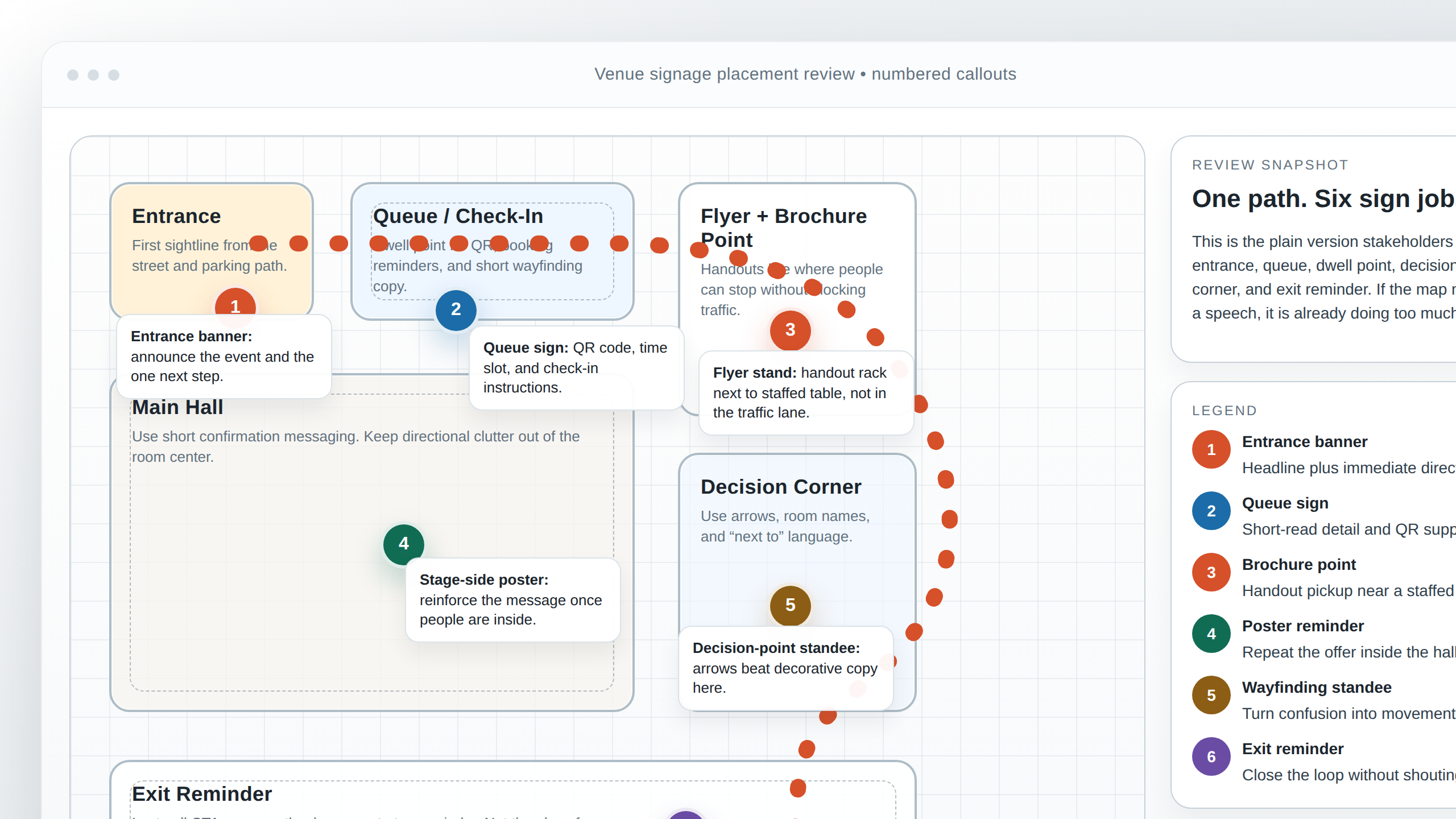
There is a useful rule I keep repeating to myself: distance reduces patience. The farther away the reader is, the less room I have for clutter, ornament, and explanatory tangents. A banner is not a debate club. A sign gets one chance to be legible.
To keep designs readable in busy spaces, I usually check these things:
- One primary focal point. The eye should know where to begin.
- Clear contrast blocks. Light text on light backgrounds is a hobby for people who enjoy disappointment.
- Short supporting phrases. Supporting text should support, not host a seminar.
- Enough negative space. The message needs air or it starts sounding desperate.
- Placement that matches movement. Put the action where the reader will actually look while approaching.
If the site is full of visual noise, I do one more thing: I remove something before adding anything. A more restrained headline, a cleaner background, or one fewer detail often improves the whole piece faster than another revision round. I have never regretted deleting the wrong line. I have regretted keeping it because it “might be useful later,” which is design code for “please bury me with this sentence.”
The Adobe guidance on printer’s marks and bleed matters here because a live layout can look fine and still fail at the edges. In venue work, the safe area is not a suggestion. It is the line between a readable piece and a visibly chopped one.
Radio-to-print consistency
Radio and print are different animals, but they should still look like they came from the same family. When I translate a radio spot into print, I keep the tone, cadence, and offer wording consistent. That way the campaign does not feel like two teams dressed the same logo in different costumes.
The FCC’s sponsorship identification guidance is useful background when the campaign includes broadcast copy, because it reminds me that radio lines have to be clear about what is being offered and by whom. Even when the legal piece is simple, the creative piece should still keep the language crisp and the offer easy to repeat.
My consistency checklist is short:
- Tone: if the radio spot is warm and direct, the print piece should not suddenly sound like a tax form.
- Cadence: short, punchy phrasing in audio should usually feel equally punchy on the page.
- Offer wording: the discount, date, or event name should stay the same unless there is a very good reason to change it.
- CTA language: “Book now” in radio should not become “learn more” in print just because someone got shy with the layout.
There is also a practical design side to this. If the radio script leans on one dominant idea, the print headline should usually do the same. If the radio spot uses a single memorable phrase, the flyer or banner can repeat that phrase visually instead of inventing a new slogan just to fill space. Consistency is not laziness; it is memory support.
When I get this right, the campaign feels easy to recognize across formats. When I get it wrong, people remember fragments instead of the message. Fragments are not a strategy. They are leftovers.
Common copy/design mismatches
I see the same mismatches over and over, and they are all fixable. The bad news is that they are boring. The good news is that boring problems are often easy to repair once you name them.
| Mismatch | What it looks like | How I fix it |
|---|---|---|
| Too many promises | The copy tries to sell the event, the food, the venue, the music, and the offer all at once. | Pick one primary benefit and move the rest lower in the hierarchy. |
| CTA buried under details | The action exists, but only after three paragraphs and a decorative divider. | Promote the CTA visually and delete anything that competes with it. |
| Unclear offer | The reader can tell something is happening but not what they get. | Add a subhead or proof line that explains the offer in plain language. |
| Typography mismatch | The tone is playful, but the layout looks severe, or the reverse. | Make the type choices and spacing reflect the copy’s energy. |
| Contact info overload | The footer or lower block is packed with every number, URL, and social handle available. | Keep only the contact path needed for the action. |
One thing I keep telling myself is that clutter is often fear in disguise. The team is afraid the reader will miss something, so they add everything. But the opposite usually happens: when everything is important, nothing is. The design gets noisier, not clearer.
Practical rule: every extra promise should earn its place by helping the reader act. If it does not, it is probably just decorative anxiety.
Quick self-review checklist before approval
Before I approve anything, I run one fast checklist. It is not glamorous, but it catches the stuff that makes clients mutter “we should have noticed that” after the file is already circulating.
- Can I read the headline in one glance?
- Does the subhead explain the headline instead of repeating it?
- Is the CTA obvious, specific, and visually distinct?
- Is there only one primary action?
- Does the offer or event detail appear early enough?
- Are contact details, QR codes, or URLs easy to find without hunting?
- Would the layout still work at the real viewing distance?
- Have I left enough space around edges, folds, or hardware?
- Does the tone match the channel if this is linked to radio or another format?
- Did I remove any line that only exists because I was emotionally attached to it?
That last question is my favorite because it usually reveals the problem immediately. A layout is not improved by preserving every sentence from the rough notes. It is improved by keeping the sentence that helps the reader move.
If the approval process keeps getting stuck on version history, a small workflow tool can help. I have seen teams use a web app builder to keep version labels, comments, and approvals in one place instead of chasing feedback across three apps and one mysterious spreadsheet named “final-final-2.” The point is not the tool. The point is reducing friction.
Mini examples: before and after
I like showing the same copy with different hierarchy decisions because the difference is often embarrassing in a helpful way. The words do not have to change much. The design decisions do most of the work.
Example 1: Too many promises
| Before | After |
|---|---|
|
Grand Opening Weekend |
Grand Opening Weekend |
What changed: the after version picks one primary action and moves the rest into support lines. The headline stays the same, but the hierarchy stops trying to headline every sentence like a nervous intern.
Example 2: CTA buried under explanation
| Before | After |
|---|---|
|
Meet the new summer menu, now available for a limited time, with fresh ingredients and a rotating list of specials that change weekly. If you want to learn more, visit the studio. |
Summer Menu, Limited Time |
What changed: the CTA moved out of the paragraph swamp and became a visible action line. The piece now behaves like a sign, not a polite essay.
Example 3: Weak contrast and weak hierarchy
| Before | After |
|---|---|
|
The offer and the contact line share the same size, weight, and placement. Everything feels equally important. |
Offer line becomes the largest element. |
What changed: the eye now has a path. The viewer can move from benefit to proof to action without wandering through a typography fog machine.
Conclusion
When I translate copy into layout, I am really doing three things: deciding what matters first, deciding how the eye should move, and making the action impossible to miss. The message map gives me the structure. The headline tells the reader why to look. The subhead and body copy make the offer believable. The CTA turns understanding into a next step.
If I keep one idea in mind, it is this: clarity is a design choice. It is not something that magically happens after the fonts are chosen. It is built by removing noise, ranking information honestly, and giving the CTA a shape that earns attention.
My final checklist is simple:
- One message map.
- One read-first line.
- One clear CTA.
- One hierarchy that survives real-world distance.
- One consistent story across print, display, and radio.
If you want help turning rough notes into a clean venue campaign system, use the contact page and send the copy, the size, and the place where the piece will live. If you want to see how that kind of thinking fits the rest of the studio’s work, the portfolio and services pages are the fastest next stops. And if you are the type who likes the logic before the leap, the about page tells you the kind of studio this is before anyone starts swapping fonts in earnest.
Key takeaways
- Start with a message map: one benefit, two support points, one CTA.
- Choose the headline as the read-first line: short, clear, and tied to the real offer.
- Let the subhead and body copy support the CTA: do not let them compete with it.
- Translate the CTA into a shape: contrast, placement, and spacing matter as much as the verb.
- Review the piece at real distance: if it fails from where the audience stands, it is not ready.
- Keep copy consistent across formats: print, display, and radio should sound like the same campaign.