
Mockups to Final Artwork: How to Build a “Client-Ready” Review Pack for Venue Campaigns
By Rowan Ellis – June 30, 2026
I treat a client-ready review pack as a decision file, not a mood board. The point is simple: one place to see the work, one place to mark changes, and one place to decide what moves forward. When that fails, the damage is usually familiar. Someone approves the wrong crop. A small line of copy disappears in the trim. A rendering looks clear on a laptop and muddy in the meeting room.
That is why the rules matter before the pack ever leaves the studio. Adobe’s guidance on printer’s marks and bleed in InDesign is a useful reminder that review files and print files are not the same thing, while Acrobat’s review comment tools show why feedback works better when it stays attached to the PDF instead of drifting through email, chat, and screenshots. For a broader standards view, the PDF Association’s note on how to annotate a PDF makes the same practical point: visible, structured annotations are easier to act on than scattered notes.
Design is the silent ambassador of your brand.
So the questions I want this article to answer are the ones people actually ask in a live project: What belongs in a review pack? What should stay out of it? How do I show print pieces, renderings, and floor-plan work in a way that reduces confusion? And how do I keep version control tight enough that approval does not turn into archaeology?
If you are building venue campaigns, banners, flyers, brochures, or presentation renderings, the same logic applies across the project. A clean review pack supports the rest of the workflow on the services side of the studio, and it is easier to trust when the visual language already matches the work shown in the portfolio. The useful takeaway is not “make more files.” It is “make fewer, clearer decisions.”
What a review pack is, and what it is not
A review pack is the set of files you send when the client needs to decide, approve, or request changes. It is not the final production bundle, and it is not a loose folder of whatever happened to be on hand that afternoon. The pack should answer three questions at a glance:
- What is being approved?
- What version is this?
- What still needs a decision?
That sounds obvious until the pack contains a banner proof, a flyer mockup, a brochure cover, and a rendering with no labels. Then the client has to infer what each page means, and inference is a slow approval method. The goal is to make the pack read like a map, not a puzzle.
| File type | Purpose | What it should never be used for |
|---|---|---|
| Review pack | Show options, context, and decisions | Final print production |
| Preflight checklist | Catch technical issues before export | Client-facing approval summary |
| Production bundle | Deliver print-ready assets to the vendor | Open-ended commentary |
That separation matters because different readers need different levels of detail. A client wants clarity. A producer wants spec discipline. A designer wants room to revise without creating a new mystery every time a file moves.
Recommended pack structure: one file, one decision path
I usually build the pack in the same order every time. The order is not decorative; it prevents the reader from bouncing between pages and losing the thread. A good pack typically includes:
- Cover page with project name, version, date, and approval status.
- Key messages or the short brief that explains what the campaign is trying to say.
- Per-media mockups for each banner, flyer, brochure cover, or rendering.
- Comment or decision page with numbered notes and approval boxes.
- Version log that records what changed since the last round.
That structure sounds small, but it removes a surprising amount of friction. The cover page tells the reader whether they are looking at version 2 or version 6. The key-message page keeps the pack focused on the campaign’s actual purpose. The mockups do the visual work. The decision page prevents a client from typing “looks good” on page 1 and then asking for a crop fix on page 8 without realizing that the same crop appears elsewhere.
Here is a compact table of contents template you can copy:
01 Cover and version notes
02 Campaign message summary
03 Banner mockup
04 Flyer mockup
05 Brochure cover mockup
06 Floor plan / rendering mockup
07 Feedback page with numbered callouts
08 Revision log and next steps
If you want to keep the pack short, keep the story intact instead. A pack with six clear pages is better than one with sixteen pages that nobody reads all the way through.
Mockup checklist for print/display: make the physical world visible
Print and display pieces fail when the pack pretends they live on a perfect white screen. They do not. They hang in real spaces, at real distances, under mixed lighting, and often next to other visual noise. The mockup has to show that context clearly enough for a client to judge whether the piece will work where it will actually be seen.
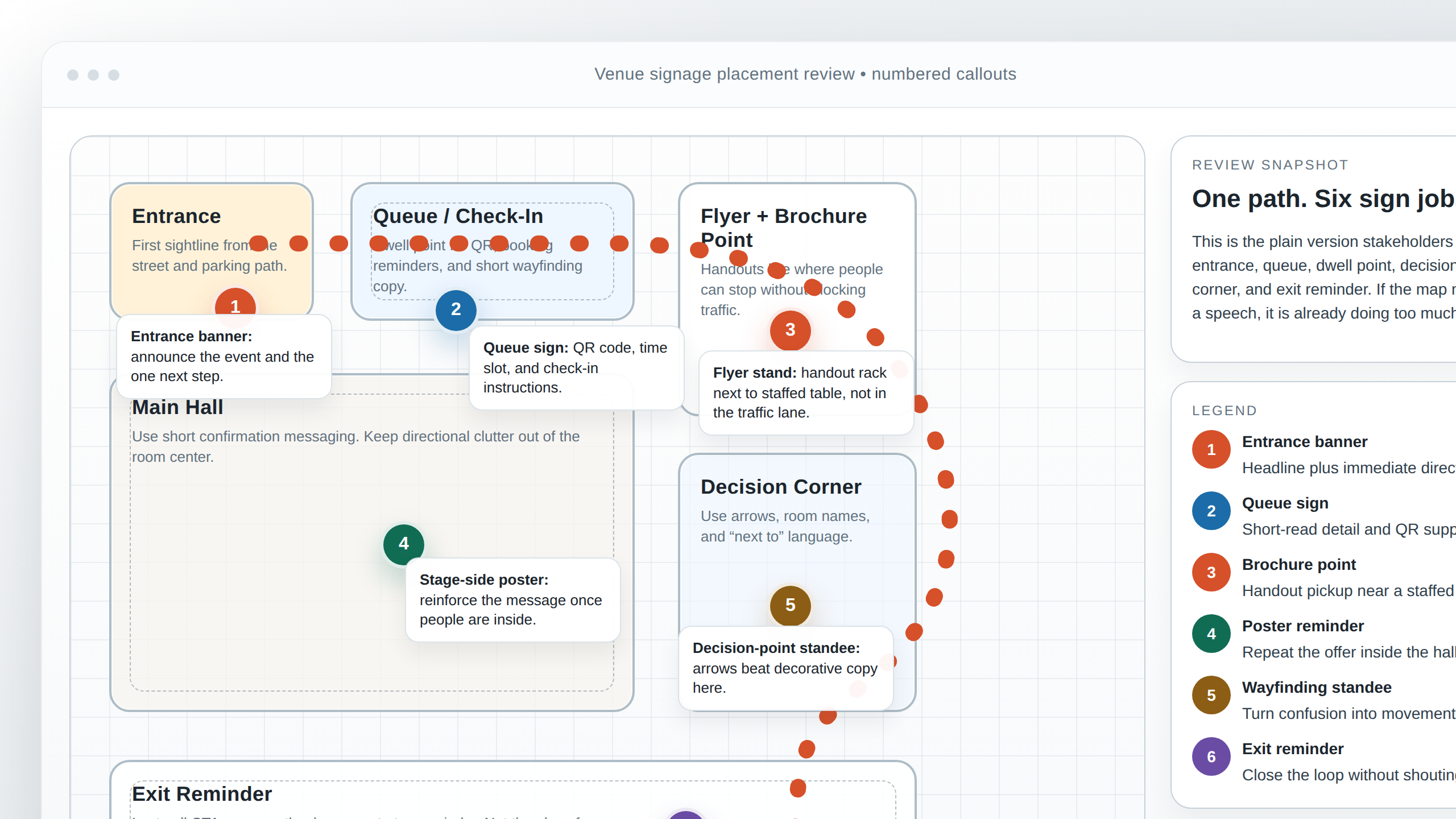
For print and display mockups, I check these items in this order:
- Size labels in the mockup title and on the page itself. Do not make the client guess whether they are viewing A4, A3, or a 3-meter banner.
- Safe areas shown with a clear inset guide or subtle frame so text does not creep into the trim edge.
- Bleed notes on the page or in a small caption when the file is intended for production.
- Realistic placement photos or context images that show where the piece belongs, not just the artwork on a blank field.
- Crop variants if the same design needs a tall, square, or horizontal version.
- Readable small text at the exact size it will appear in the final environment.
A strong display mockup answers the “where does this live?” question before anybody gets to color or typography preferences. That is particularly helpful for venue campaigns, because the piece is often designed for a wall, a corridor, a registration desk, or a queue line rather than a browser tab. If the mockup does not make the placement obvious, the pack is not finished yet.
A practical rule: if the mockup works only after the client explains the scene back to you, the mockup is too vague. It should carry the scene itself. You should not need a paragraph of decoding just to understand where the banner hangs.
Mockup checklist for renderings and floor plans: keep the geometry honest
Floor plans and renderings have a different problem. They are often more technical than print pieces, but clients still need to read them quickly. The pack should help stakeholders compare options without turning the page into a drafting exercise.
When I review rendering or floor-plan pages, I look for four things:
- Camera angle consistency so one version does not appear to “move” simply because it was framed differently.
- Scale cues that make the layout legible, such as people, furniture, signage blocks, or clear room labels.
- Readable text sizing so the annotation labels can still be read on a laptop screen without zooming twice.
- Unambiguous zones that identify entrance points, queue areas, handout points, and decision points.
There is a narrow line here. Too little context, and the rendering becomes abstract. Too much detail, and it becomes crowded. The client should be able to say, “I know what this space is doing,” without having to inspect the file like a survey map.
Where projects include multiple views, I prefer a consistent naming logic and repeated viewpoint. If page 1 shows the entrance from one angle, page 2 should not jump to a wildly different perspective unless the change is deliberate and labeled. Consistency is the quiet helper that lets the client compare the options instead of re-learning the scene on every page.
For presentation-level review packs, the strongest rendering pages are usually the ones that combine a simplified overhead map with one or two clean perspective views. That gives the client both the “where” and the “what it feels like.”
Export settings for review: separate the readable file from the production file
One of the easiest ways to reduce back-and-forth is to export two PDFs on purpose: a compressed review version and a print-ready version. The review PDF should open quickly, stay readable on a laptop, and carry the comments cleanly. The print-ready PDF should keep the bleed, marks, and output settings the vendor needs.
That split follows the logic in Adobe’s print guidance: bleed and crop marks belong to the file that is headed for output, not the file that exists to help a client approve the design. The review copy exists to support decisions; the production copy exists to support output.
| Version | What to include | What to reduce or omit |
|---|---|---|
| Review PDF | Mockups, labels, comments, decision boxes | Heavy image data, unnecessary printer marks, oversized assets |
| Print-ready PDF | Final artwork, bleed, crop marks, vendor specs | Loose commentary, draft notes, experimental labels |
My naming rule is plain and dull, which is why it works:
project-name_asset-size_version-stage_date.pdf
venue-campaign_banner-3000x1000_review-v03.pdf
venue-campaign_brochure-cover_review-v03.pdf
venue-campaign_floor-plan_print-v05.pdf
Keep the version number visible in the file name, and keep the same version visible on the cover page. That way the PDF itself tells the story even when it escapes the email thread. There is a reason people invent version control systems. An approval pack is one of them.
For teams that want to turn review comments into a lightweight internal workflow, a web app builder can be a practical way to prototype the tracking layer before anyone commits to custom development.
How to annotate feedback: number the problem, not the personality
A review pack gets much easier to manage when every note can be traced to a page and a number. The best feedback is specific enough to act on and restrained enough to stay useful. “Make it pop” may be a mood. It is not an instruction.
Adobe’s comment tools and the PDF Association’s annotation guidance both support the same working rule: the reader should be able to point to a location, attach a note, and keep the note visible in context. That is the whole game. The pack is not trying to replace conversation; it is trying to make the conversation precise.
My preferred annotation system uses three layers:
- Page number so the reviewer and designer are looking at the same file location.
- Callout number so each issue stays distinct.
- Decision tag so the reviewer can say whether the item is approved, revised, or held.
For example:
| Callout | What it means | Typical action |
|---|---|---|
| 1 | Headline crop on the banner is too tight | Revise |
| 2 | Phone number is correct but too small on the flyer | Revise |
| 3 | Brochure cover image choice is approved | Approve |
| 4 | Floor-plan label is missing a room name | Revise |
Then I add a simple decision box at the end of the pack:
- Approve: the item is ready for production.
- Revise: the item needs a specific change before approval.
- Hold: the item is paused until a missing input arrives.
That sounds mechanical, and it is. Mechanical is good here. The more mechanical the decision language, the less room there is for tone, status anxiety, or mistaken assumptions. The pack should collect decisions, not drama.
Common approval failure points, and how to prevent them
The same few problems appear again and again. The advantage of that repetition is that it makes prevention easier than rescue.
| Failure point | What usually caused it | How to prevent it in the review pack |
|---|---|---|
| Wrong crop | The mockup did not show the trim or safe area clearly | Label the crop and include a visible margin guide |
| Low-resolution images | The image looked fine on screen but not at display size | Show the final size in the mockup title and note image source limits |
| Unreadable small text | The type size was acceptable in layout software but not in context | Use a realistic view distance or zoom level in the mockup |
| Mismatched branding | Different files used different logo versions, colors, or tone | Put one brand reference page at the front of the pack |
| Version confusion | Multiple drafts were circulated with similar names | Use a strict version number in the file name and cover page |
| Unclear approval authority | No one knew who had the final say | Identify the approver on the first page, not in the email body |
If I had to name the most expensive mistake, it would be leaving the wrong version in circulation. A review pack should make that difficult. The person reading it should not have to guess whether page 4 is a draft, a near-final, or a final artwork export someone forgot to rename.
This is also where the studio’s wider communication path helps. If the client needs an explanation, the pack should point them to the right person on the about page or directly to the contact path, instead of forcing them to search a dozen replies for the same answer. The less the pack relies on memory, the better it will survive the week.
Timeline tip: draft early, but not too early
There is a timing problem in almost every venue campaign. Send the draft too soon, and the client reacts to unresolved direction rather than a visible design. Send the near-final pack too late, and there is no room left for meaningful changes. The useful middle ground is a two-step send:
- Draft pack for direction, structure, and major content alignment.
- Near-final pack for crop, copy, image choice, and final approval.
The draft pack should be clear enough to steer the project, but not so polished that the client feels trapped by the first thing they see. The near-final pack should be clean enough that revision notes are small and specific. That split reduces the strange project stage where everyone is “almost done” but no one can say with a straight face that the file is approved.
When the project includes print and display pieces together, I prefer to send the shared pieces in one review pack rather than scattering them across several attachments. The reader can then compare the banner headline, flyer message, brochure cover, and floor-plan language in one sitting. Approval tends to move faster when the reader does not need to re-enter the project three times.
Quick template you can copy
If you need a bare-bones version of this process, use the following structure for the next venue campaign. It is small on purpose.
REVIEW PACK
Project:
Client:
Version:
Date:
Approver:

1. Campaign summary
 - Main message
 - Audience
 - Primary action

2. Page 1: Brand and message reference
3. Page 2: Banner mockup
4. Page 3: Flyer mockup
5. Page 4: Brochure cover mockup
6. Page 5: Rendering or floor-plan mockup
7. Page 6: Feedback and decision boxes
8. Page 7: Version log and next steps
And here is the file naming rule in plain language: keep the project name, asset type, version, and stage in every file. If someone opens the attachment outside the email thread, they should still know exactly what it is. That alone prevents a lot of awkward follow-up messages.
One more practical habit helps more than people expect: keep a single cover page that says what changed since the last review. Even a short sentence like “headline shortened, banner crop adjusted, floor-plan labels clarified” gives the reader a reason to look again without scanning the whole pack from zero.
For a related view of campaign structure, the studio’s home page is a good place to start if you need the broader context first, but the review pack itself should always stay focused on the decisions in front of the client.
Final check: what a client-ready review pack should achieve
A good review pack does four things well. It shows the work in context. It labels the version clearly. It keeps feedback attached to the page. And it leaves the client with a small, obvious decision path instead of a stack of open questions. That is the point of the whole exercise.
If the pack is working, the reader should be able to answer the following without asking for clarification:
- What am I approving?
- What should change?
- What stays as-is?
- What is the next step after approval?
That is the standard I use before sending the file. Not because it sounds elegant, but because it saves everyone from the slow, tedious kind of revision that comes from ambiguity. If you want a cleaner approval loop for the next venue campaign, start by tightening the review pack before you add another round of design.
If you need help turning rough mockups into a cleaner client pack, use the contact page and send the project name, version number, and the files you want reviewed.