Venue Advertising That Converts: A Checklist for Banners, Flyers, and On-Site Signage
Venue advertising usually fails in one of two boring ways: nobody decided the primary action, or everybody kept adding copy until the sign stopped doing its job. Start there. Save yourself the expensive drama later.
If someone sees your banner, flyer, brochure, or poster for three to seven seconds, what do you want them to do next? Buy tickets? Scan a code? Call? Walk to the registration desk? Visit a landing page? If the team cannot answer that in one sentence, the design is not the problem yet. The brief is.
For broader planning context, teams can compare guidance from web.dev guidance before choosing a workflow.
This guide is built as a working approval checklist for venue teams, event organizers, and brands that need on-site advertising to stay readable, consistent, and easy to place. It is not a sermon about “making things eye-catching.” That phrase has injured enough layouts already. The actual job is simpler: one message hierarchy, format-specific rules, placement at decision points, and a clean handoff before anything gets printed or installed.
If you want a quick sense of how this fits the studio’s broader work, start with the home page, then see the relevant production support on our Services page, browse related deliverables in the Portfolio, read more about our approach on the About page, and use the Contact page when you want an actual review instead of another internal meeting.
The Goal: Define the Primary Action First
Rule this out first: are you asking one piece to do three jobs? That is how banners turn into paragraphs and flyers turn into apology notes. Pick the primary action before anyone chooses type sizes or photo crops.
Related implementation details are also covered in MDN Web Docs, which helps keep tool decisions grounded in established practices.
- Tickets or reservations: the piece must make the date, offer, and booking step obvious immediately.
- Phone call: the number must be large, clean, and not trapped under decorative clutter.
- Website or landing page visit: the URL or QR must lead to the exact offer, not a generic homepage maze.
- Walk-in instruction: the sign must tell people where to go next, not just that something exists.
- QR scan: the code supports the CTA. It is not the CTA by itself.
Here is the approval question I would use: If a person notices this for three to seven seconds while moving, what single next step should remain in their head? If the answer is fuzzy, stop editing visuals and fix the brief. Better copy discipline beats another round of decorative panic.
Approval rule: write the primary action in one sentence before approving any layout.
Message Hierarchy That Works On-Site
Venue advertising works when every format follows the same hierarchy, even if the amount of detail changes. The order is not mysterious.
- Headline: what it is and why now. Event, offer, or venue. No slogan fog.
- Benefit: one concrete reason to care. Not “experience excellence.” Something a normal person can repeat.
- Proof: dates, lineup, capacity, what is included, location detail, or another specific fact you can verify.
- CTA: one action only. Scan, book, call, visit, reserve.
- Contact: only the minimum needed to complete the action.
If you reverse that structure, the piece becomes work. People do not owe your poster effort. They glance, they filter, they keep moving. The hierarchy has to carry the burden, because the audience usually will not.
| Layer | What it should answer | Common failure |
|---|---|---|
| Headline | What is this? | Vague campaign line with no event or offer context |
| Benefit | Why should I care? | Meaningless adjective pile |
| Proof | Why should I believe it? | Specifics hidden too low or missing entirely |
| CTA | What do I do next? | Two or three competing actions |
| Contact | How do I complete it? | Too much secondary detail stealing attention |
Secondary information belongs lower on the piece, on the back of the flyer, or inside the brochure. It does not belong where the eye is supposed to find the main action first.
Approval rule: if a reviewer cannot point to headline, benefit, proof, CTA, and contact in five seconds, the hierarchy is still broken.
Format Checklist: Banners
Banners are distance tools. Treat them like distance tools. The audience is often approaching at an angle, moving, distracted, or both. This is not where your twelve-line explanation belongs.
- Prioritize headline first and CTA second: contact details come last.
- Keep lines short: large type needs room. A banner is not improved by squeezing.
- Use bold, high-contrast typography: thin fonts disappear faster than optimism in a revision call.
- Protect safe margins: keep key text away from trim, mounting points, grommets, poles, and frame edges.
- Crop images for clarity: if the important detail is tiny, it is already lost at distance.
- Check the approach path: the CTA must be visible from the actual direction people arrive.
If people keep missing the banner, do not start by blaming the audience. Check whether the headline is too small, the contrast is weak, or the banner is mounted where the CTA is only visible after the decision moment has passed.
Approval rule: stand back to the expected viewing distance and confirm the headline and CTA are readable before worrying about anything else.
Format Checklist: Flyers
Flyers are hand-plus-scan assets. People either receive them directly or spot them in a rack, on a counter, or near an entrance. That means the front has to answer the basic questions immediately.
- Front side must cover: what it is, when it happens, why it matters, and what to do next.
- Back side can hold: schedule, FAQs, map, terms, or secondary detail. Keep it scannable.
- Place QR near the CTA: not in a corner cemetery where useful elements go to die.
- Watch paper and finish choices: contrast must hold in the actual lighting conditions where the flyer will be used.
- Use obvious grouping: dates with location, CTA with QR, contact details together.
If the flyer is handed out and the CTA still requires hunting, you have too much competing content or the hierarchy is upside down. Flyers do not need more cleverness. They need faster orientation.
Approval rule: cover the back and confirm the front alone is enough for a reader to understand the offer and take the next step.
Format Checklist: Brochures
Brochures allow more information, which tempts people to write too much. Resist that. A brochure is a skimming document, not a hostage situation.
- Cover: headline, benefit, and CTA.
- First open area: date, time, location, what is included, or the most important decision details.
- Inside panels: supporting detail, features, schedule, venue zones, packages, or directional information.
- Back panel: contact, reminder CTA, quick reference details.
- Proof elements: lineup, capacity, feature list, or testimonials only if you can substantiate them.
Walls of text are usually a symptom, not the disease. The disease is refusing to rank the information. Break content into short sections, bullets, and headings that a person can scan in 30 seconds without feeling punished for picking up the brochure.
Need examples of how brochure and signage work together? The Portfolio is the right place to compare print and venue presentation deliverables without turning the article into a gallery.
Approval rule: open the brochure and check whether the decision-critical information appears before the long explanatory content.
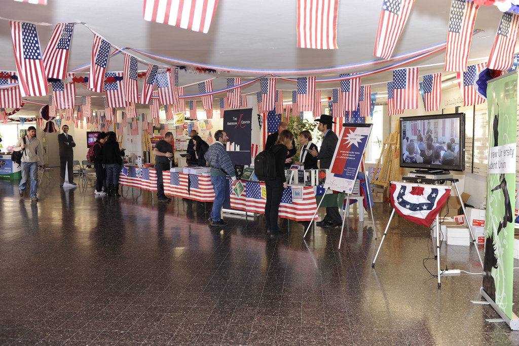
Format Checklist: On-Site Signage
This bucket covers posters, standees, decals, counter cards, and directional signs. The mistake here is treating all signs as if they do the same job. They do not.
- Entrance signs: announce and direct. Keep wording short and CTA obvious.
- Queue signs: explain next steps, wait-time context, offers, or QR-enabled actions while people have dwell time.
- Decision-point signs: use arrows, room names, floor levels, or “next to” references.
- Reminder signs: repeat one action after the first exposure. Do not restate the whole campaign.
- Window and reflective surfaces: check glare, contrast, and viewing angle before approving placement.
If multiple signs exist, assign each one a distinct job: direction, offer, reminder, or information. When every sign tries to do everything, none of them do much of anything.
Approval rule: label every sign in the plan with its single job before approving the artwork set.
Design for Viewing Distance: The Boring Rules That Save You
Check the boring things first. They are usually the actual problem.
- Contrast first: dark on light or light on dark. Brand colors are not exempt from physics.
- Headline size must match distance: body text only belongs where people can stop and read.
- Limit words per line: long lines slow scanning and collapse clarity.
- Use consistent spacing: cramped copy reads like panic, which is often accurate but not helpful.
- Protect safe margins: trimming, hardware, frames, and folds all steal space.
- Test against environmental noise: busy walls, mixed lighting, reflections, and passersby compete with your piece.
If you cannot read it from across the room, that is not a branding problem. It is a distance problem. Solve it with size, contrast, and content reduction. Decorative flourishes can wait their turn, preferably outside the critical path.
Approval rule: review every format at its intended viewing distance before signing off on the final file.
Placement Planning: Sightlines, Entrances, Queues, and Corners
Placement beats decoration. You can approve a perfectly decent banner and still waste it by mounting it where people only notice it after they have already chosen the wrong doorway.
Use a repeatable path check:
- Map the visitor route: entrance to check-in, queue, room, seating, service point, and exit.
- Mark sightlines: where are people already looking while moving?
- Mark dwell points: queues, waiting zones, counters, elevators, stair landings, and seating edges.
- Mark decision corners: turns, forks, doors, and level changes.
- Match sign type to moment: big headline at the approach, directional copy at the corner, deeper detail where people stop.
Do not place everything at the entrance. The second and third decision moments matter just as much. People need confirmation after they commit to a direction, not just one heroic sign near the door pretending it solved the entire route.
Approval rule: approve placement against the visitor path, not against a blank floor plan in isolation.
QR and Tracking Basics Without Turning It Into a Science Project
QR works when it has a job. It fails when it becomes a decorative superstition added because someone felt modern for ten seconds.
- Place QR near the CTA: same visual cluster, eye level when possible.
- Make the destination match the sign: same headline, same offer, same next step.
- Avoid dead-end destinations: a generic homepage is only acceptable if the exact offer is still immediately visible.
- Define success before launch: scans, calls, reservations, bookings, or check-ins.
- Keep naming consistent: track links by asset and placement so the data means something later.
If the on-site piece points to a lightweight registration or booking flow rather than a full website, sketch that support layer before launch. A plain approval mock or simple landing-page wireframe is enough. The useful question is not whether the destination feels impressive. It is whether the same headline, offer, and next step survive the scan without making people hunt for them.
Approval rule: scan the code on a phone and confirm the landing page repeats the offer and action without making the user search for it.
Consistency Rules Across Media
Consistency does not mean cloning the same layout into every size. It means enforcing the same brand rules while letting each format do its own job.
- Logo usage: one approved lockup set, one clear minimum size rule, and no random stretching because someone was in a hurry.
- Color palette: use the same core colors, but adjust contrast for readability where needed.
- Photo style: keep image treatment consistent, whether that means clean venue photography, product detail, or event atmosphere.
- Copy tone: the banner, flyer, brochure, and landing page should sound like the same campaign, not four departments with unresolved trust issues.
- CTA language: use the same action wording everywhere unless the step genuinely changes.
That consistency is part of how we structure review work across formats. If you want the broader studio context behind that approach, the About page covers how AMV Network handles multi-format design work without drifting into generic agency theatre.
Approval rule: review all formats side by side and check whether the same campaign looks and sounds like the same campaign.
Artwork Handoff Checklist
This is the part people try to skip because it feels administrative. Then the reprint arrives and suddenly administration has a fan club.
| Item | What to approve |
|---|---|
| File type | Printer-ready PDF where required, plus working files only when explicitly needed |
| Bleed | Included where trimming requires it, with no critical copy near cut edges |
| Safe area | Headlines, logos, QR codes, and contact details protected from trim and hardware |
| Color mode | Exported in the mode the production partner expects, with no accidental web-only assets |
| Version naming | Clear format, version, and date so nobody prints the wrong file by accident |
Add two more checks while you are there: confirm linked images are high enough quality for the final size, and confirm the approved file matches the proof that was actually signed off. “Final-final-use-this-one” is not a versioning strategy. It is a cry for help.
Approval rule: do not release production files until file type, bleed, safe area, color mode, and version naming have all been checked explicitly.
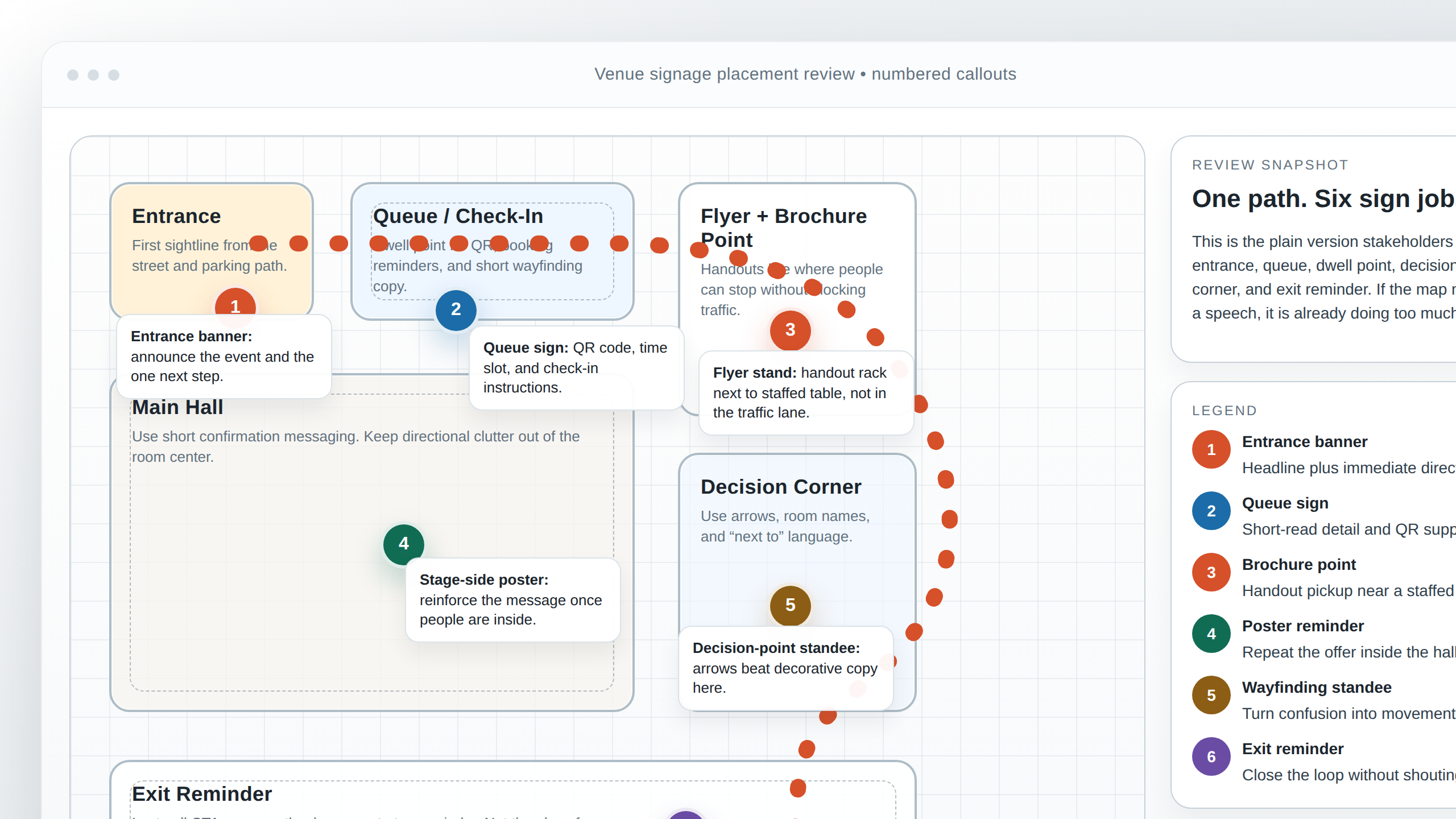
Floor Plan and Rendering Tips for Stakeholder Reviews
A floor plan or rendering should reduce confusion, not show off your ability to make a layout look busy. Keep it simple enough that venue managers, installers, and decision-makers can all read the same story from it.
- Label zones clearly: entrance, queue, registration, sponsor wall, seating, stage, exit reminder.
- Use numbered markers: match each marker to a signage type or action.
- Show arrows only where direction matters: too many arrows turn the plan into weather coverage.
- Differentiate sign types: banner, poster, standee, decal, counter sign, or brochure point.
- Keep the callout language plain: no internal shorthand that only two people in the room understand.
- Show scale honestly enough: stakeholders do not need engineering detail, but they do need a believable sense of location and spacing.
If the plan is being used for approvals, include only the details needed to support those decisions. You are not producing a novel. You are giving people a readable map of where the message lives. For related examples of presentation-style deliverables, the Portfolio is the sensible next stop.
Approval rule: if a non-designer cannot explain where each sign goes after looking at the plan for one minute, simplify the plan before moving on.
What to Check Before You Approve Anything
- State the primary action in one sentence.
- Confirm the hierarchy: headline, benefit, proof, CTA, contact.
- Review each format against its real viewing distance.
- Check placement against path, sightlines, dwell points, and decision corners.
- Scan the QR and verify the destination matches the sign.
- Review all assets side by side for logo, color, photo, and tone consistency.
- Approve file type, bleed, safe area, color mode, and version naming before release.
- Use a simple floor plan or rendering to show where each sign belongs.
If you are still fixing the piece by adding copy, stop. You are probably correcting the wrong thing. Fix the action, the hierarchy, the distance logic, or the placement. Those are the usual suspects. They keep being the usual suspects because the boring things keep winning.
If you want a second pair of eyes on banners, brochures, on-site signage, or supporting venue presentation visuals, use the Contact page and send the layout, placement notes, and intended action. That is the first diagnostic step I would run before changing anything else.
When campaign planning starts to outgrow spreadsheets, Flatlogic's custom web development services are a useful reference for scoping a simple client portal, approval workflow, or asset dashboard.