
Venue Floor Plan Renderings for Advertising: What to Include (and What to Avoid)
A good venue floor plan rendering should make decisions easier, not louder. It should tell a client where things go, what the placements mean, and what still needs confirmation without forcing anyone to decode a busy drawing. That is the real test.
When people search for help with venue floor plan renderings, they are usually asking a cluster of practical questions: What belongs on the plan? How do I keep it accurate? How much label detail is too much? And what should I leave for the brochure, the banner, or the radio spot instead? Those are the right questions. A floor plan is not decoration. It is a working document.
That matters because a floor plan is a visual language, not just a sketch with arrows. The basic idea of a floor plan depends on shared conventions, while the idea of a legend depends on a shared symbol system; without those, readers have to guess. Readability matters too. The W3C contrast guidance is written for web content, but the principle carries over neatly: color is only useful when the information stays legible. If the labels disappear, the rendering has stopped doing its job.
In this guide, I will walk through what to include, what to avoid, and how to review a floor plan rendering so it is useful for the venue team, the client, and the people who still have to install the work afterward. If you want a broader view of how this kind of work fits into a studio process, the services page and the portfolio are a sensible place to start.
What you will get here: a simple decision guide for when a floor plan is the right tool, a checklist for the core deliverables, an accuracy pass for scale and naming, readability rules that prevent clutter, and a clean handoff workflow for approval and export.
Quick terms before we start
Floor plan work moves faster when everyone uses the same words. I like to define the basics up front so nobody has to pretend they know what “overlay” means while quietly opening a new tab.
| Term | What it means here | Why it matters |
|---|---|---|
| Floor plan | A top-down view of the venue that shows rooms, zones, circulation, and placement positions. | It gives the viewer a shared spatial reference. |
| Rendering | A cleaned-up visual presentation of that plan, usually with labels, symbols, and branded markers. | It makes the raw layout easier to read and approve. |
| Placement overlay | An added layer that shows where a banner, stand, poster, or sign sits in the space. | It separates the structure of the venue from the advertising inventory. |
| Legend | A key that explains symbols, colors, numbers, or arrows used on the plan. | It stops the design from becoming a private codebook. |
| View option | A variant of the plan for a specific audience or angle, such as entrance-first, full-venue, or zone-by-zone. | Different reviewers need different levels of detail. |
When a floor plan is the right tool, and when it is not
I start here because a floor plan rendering is useful only when the spatial question is real. If the client needs to understand where visitors move, where signage can fit, or how different placements relate to one another, a plan is the right tool. If the question is mainly about tone, headline wording, or a simple promotional message, a layout sheet may be overkill.
Use a floor plan rendering when the project needs one or more of these:
- Clear placement decisions for banners, stands, posters, or directional signs.
- A shared view of entry points, queues, reception areas, or main circulation paths.
- Approval from a venue team that needs to understand the plan quickly.
- A record of where each advertising element sits before production starts.
- A way to compare options without walking the site again for every revision.
It may not be the right tool when:
- The venue is still changing and the measurements are not trustworthy yet.
- The client only needs copy direction, not spatial planning.
- The placement is so simple that a marked-up photo would be clearer.
- The design risks turning into a pretty map that no one can read under pressure.
That last point matters more than people admit. A rendering can make a weak brief feel more finished than it really is. The trick is to use the plan to reduce uncertainty, not to hide it.
Practical rule: if the plan will help someone make a placement decision in under a minute, use it. If it will only impress someone for ten seconds and confuse them for the rest of the meeting, choose a simpler asset.
When the use case is unclear, I prefer to ask for one of three alternatives: a marked-up site photo, a simple placement sketch, or a short brief page that explains the venue zones in plain language. If you need help framing that kind of scope, the contact page is the place to ask before anyone starts polishing the wrong file.
Core deliverables: what the plan must include
A useful venue rendering is built from four parts: the base layout, the placement overlays, the legend and labels, and the view options. Leave one of those out and the reviewer has to do extra mental work. The reviewer will do that work once, maybe. Then they will ask for a revision.
The legend is especially important because every symbol on the page either helps comprehension or creates doubt. If the key is incomplete, the best layout in the world turns into a puzzle.
| Deliverable | What to include | What to avoid |
|---|---|---|
| Base layout | Walls, rooms, zones, main circulation, doors, and any fixed features that affect placement. | Decorative fills, tiny furniture clutter, or unnecessary visual noise. |
| Placement overlays | Banner positions, stand locations, sign zones, direction arrows, and numbered callouts. | Overlapping markers, multiple arrow styles, or too many competing colors. |
| Legend and labels | Symbol key, room names, zone names, orientation marker, and contact notes if needed. | Hidden meanings, unlabeled icons, or labels that only the designer understands. |
| View options | At least one full-venue view and one decision-focused view, such as entrance-first or zone-first. | Sending only the “pretty” version and hiding the practical one. |
Base layout: this is the skeleton. It should be clean and honest. If a wall is fixed, show it. If a doorway matters, show it. If a corridor narrows where people queue, show that too. The base layer is not where you do marketing; it is where you establish the space.
Placement overlays: these are the advertising choices. A floor plan for a venue campaign often needs to show a banner at the entrance, a stand near registration, and a poster by the queue. Each overlay should answer one question: “Where exactly is this thing going?”
Legend and labels: use one naming system and stick to it. If the same room is called “Main Hall,” “Event Hall,” and “Hall A” in the same file, the plan becomes a negotiation. Nobody wants a negotiation inside a PDF.
View options: different reviewers need different cuts of the same information. A venue manager may want the full layout. A brand client may want the entrance view. An installer may want the narrow working section with measurements and arrows. Do not force one image to do four jobs badly when two images would do them well.
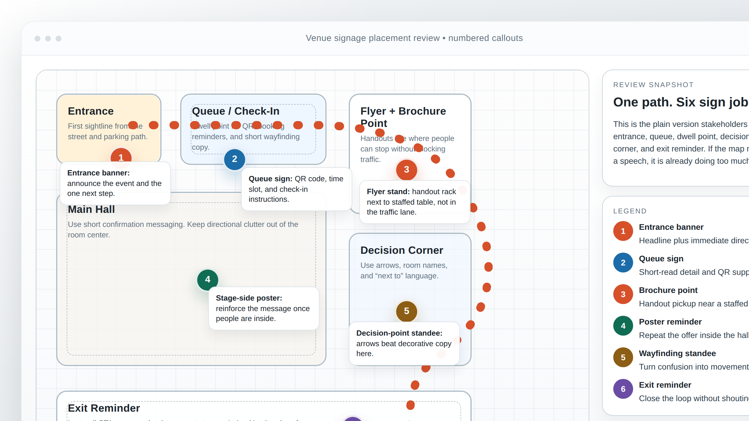
That screenshot-style view is useful because it stays close to the decision. It says where things belong without asking the reviewer to read a lot of extra decoration.
Accuracy checklist: scale, names, orientation, and missing measurements
The fastest way to lose trust is to draw confidence into a plan that does not have accurate measurements behind it. If the geometry is wrong, the artwork is polite fiction. A neat fiction, perhaps. Still fiction.
I use a short accuracy pass before any rendering goes out:
- Check that the base dimensions match the latest venue measurements.
- Confirm scale cues are present, even if the drawing is not a fully dimensioned technical plan.
- Use one room and zone naming system from start to finish.
- Mark orientation clearly with a north arrow or a simple entrance-facing note.
- Identify all entry points that affect traffic flow or sign visibility.
- Flag anything that is estimated, approximate, or unverified.
- Separate “known” measurements from “best available” measurements.
Scale cues: readers do not always need a technical drawing, but they do need enough scale information to understand relative size. A corridor that feels narrow on screen may be wider than it looks. A small stand may actually block a doorway if the proportions are wrong. If the plan does not help the viewer estimate size, it is missing an important function.
Room and zone naming: names should be stable, specific, and human-readable. “Registration” is better than “Area 2.” “Main Hall” is better than “Big Room.” If the venue already uses local labels, keep them, but do not invent new nicknames halfway through the file. Consistency is the quiet hero here.
Orientation and entry points: always show how someone enters the space. A beautiful plan that forgets the door is not helpful to a person standing at the door. A tiny arrow, a bold entrance label, or a clear “from lobby” note can save a great deal of back-and-forth.
When measurements are missing: do not guess in silence. Mark the unknown sections, add a visible note, and tell the client what still needs confirmation. I would rather publish a careful “approximate” than a confident mistake. One helps the team make a decision. The other creates a second meeting.
If you are building the approval package from scratch, the about page is a good place for clients to understand how the studio approaches careful, practical work before they ask for a faster version than the site can honestly support.
Readability rules: labels, contrast, and color meaning
Readability is not a finishing touch. It is the reason the rendering exists. A plan can have perfect measurements and still fail if the labels are too small, the contrast is too low, or the colors mean five things at once. That is how a useful file becomes office wallpaper.
The visual hierarchy principle is the simple one to remember: the most important thing should be the easiest thing to see. In a floor plan, that usually means room names, placement markers, and movement arrows should be more visible than background styling.
These are the rules I would keep:
- Give primary labels the highest contrast on the page.
- Keep secondary notes smaller, but still readable at review size.
- Use one label style for rooms, one for placements, and one for notes.
- Limit the color palette to a small set of meaning-based choices.
- Reserve one standout color for the most important campaign marker.
- Do not use color as the only way to distinguish a critical item.
Minimum text size: the exact point size depends on the final output, but the rule is simple: if someone has to zoom in to read the room names, the labels are too small. Keep in mind that clients often review these files on laptops, not on a color-calibrated studio monitor with perfect lighting and infinite patience.
Contrast: white text on a pale image, gray text on a textured background, and thin text on a busy floor texture are all common ways to lose legibility. The W3C contrast guidance is useful here because it reminds us that contrast is not a decorative preference; it is a functional requirement. If the reader cannot distinguish the label quickly, the design is not finished.
Color meaning: use color to organize, not to perform. If blue means entrances, green means client placements, and red means restricted zones, document that clearly in the legend. Do not let a nice palette drift into accidental symbolism. A rendering is not a mood board.
One more practical note: if a color choice weakens the message, change the color. The brand will survive. The reading experience should not be sacrificed for a prettier background that no one can use.
Placement overlays: how to show locations without clutter
Placement overlays are where floor plan renderings either become useful or become noisy. The goal is to show advertising locations clearly enough that the venue team can act, while keeping the base layout visible enough that the space still makes sense.
I like a layering approach:
- Start with the base layout. Keep the venue structure clean and neutral.
- Add fixed features next. Use just enough detail to explain traffic flow and physical limits.
- Add placement markers. Use numbered circles, pins, or boxes for each ad position.
- Add short callouts. Keep them factual: size, type, and zone name.
- Use one emphasis layer only. If everything is bold, nothing is bold.
Example: if a venue has an entrance banner, a standing sign by registration, and a poster near the coffee area, I would not give each item a different icon family, a different arrow style, and a different color shade. I would give each one a number, a simple marker, and one line of supporting text in the legend. That keeps the page calm.
When the space is complex, make separate views instead of piling every placement into one image. A full-venue map can show context. A cropped detail view can show the exact cluster of placements near the entrance. Reviewers appreciate being told the same thing twice in two useful ways. They do not appreciate being shouted at in one crowded picture.
If the client needs help deciding which markers matter most, a lightweight workflow discussion can be useful before the design gets too far along. In some studios, a neutral reference such as AI consulting services is used only as a way to think through intake, versioning, or approval routing before automation is added. That kind of planning belongs in the workflow, not the decoration.
CTA and messaging placement: what belongs on the plan
Not every message deserves to live on the floor plan. That sounds obvious until a team tries to turn one drawing into a complete marketing package. The plan should help people orient themselves and approve placement. The brochure, the banner artwork, and the radio script can carry the fuller message.
Here is a clean way to divide the work:
| On the floor plan | In separate assets |
|---|---|
| Placement name, size, and location | Headline, offer copy, and detailed benefits |
| Short direction cue, if needed | Longer CTA phrasing and supporting proof |
| Numbered sign references | Brand story, speaker notes, or script copy |
| Legend notes for approval | Print-ready artwork and audio deliverables |
Use the plan for placement facts. A short CTA note such as “Register here” or “Ask staff for details” may be enough if the plan is being reviewed by a venue team. Anything longer usually belongs elsewhere. If the plan starts competing with the marketing copy, it is doing too much.
Use separate assets for the persuasive work. The floor plan should not try to persuade, explain, orient, and sell all at once. That is how readers miss the actual placement details. The more the plan sounds like an ad, the less it behaves like a plan.
Keep the messaging hierarchy honest. The plan says where. The ad says why. The contact path says what next. If those three jobs blur together, approvals slow down.
Client review workflow: what to ask for during approvals
A clean review process saves more time than another round of design polish. Most delays are not caused by art direction alone; they come from missing facts, unclear comments, or five people replying with “looks fine” when someone actually meant “the door is wrong.”
My approval checklist usually asks for the following:
- Recent venue photos, especially if the space has changed.
- Marked-up drafts from the venue team or client decision-maker.
- Confirmation of room and zone names.
- Confirmation of entry points and traffic flow assumptions.
- Approval of placement numbers and symbol legend.
- One person responsible for the final sign-off.
- A clear note on what counts as a revision versus a new request.
How to handle marked-up drafts: do not treat comments as emotional weather. Treat them as instructions. If a client circles a placement and writes “move closer to entrance,” ask whether that means a few meters, a different wall, or a new visibility priority. Small words can hide large changes.
How to manage sign-off: approval should cover names, placement locations, sizes, and any notes marked “approximate.” If the client approves a draft with a missing measurement, that missing measurement still needs a note attached to it. Silence is not sign-off.
What to do when feedback conflicts: if the venue wants one placement and the brand wants another, do not average the answer. That usually creates a worse answer. Surface the tradeoff, show the impact in the plan, and ask the client to choose the priority.
For teams that want a simple handoff path after the review, the contact page should make it easy to send questions, mark up drafts, or request a clarification before the file moves into production.
Common mistakes to avoid
Most mistakes in venue floor plan renderings are not dramatic. They are small and cumulative. One fuzzy label, one vague legend, one overdesigned color choice, and suddenly the file is harder to trust than the original sketch.
- Misleading scale. A plan that makes spaces look bigger or smaller than they are creates bad placement decisions.
- Unreadable micro-text. If only the designer can read the labels, the plan is not ready.
- Inconsistent legends. Changing symbols mid-file forces reviewers to relearn the system.
- Unclear orientation. Without an entry point or directional cue, the audience has to guess how to read the space.
- Too many colors. A rendering is not a festival wristband chart.
- Decorative overlays. Effects that do not help placement can make the file feel finished while reducing its value.
- Missing measurement notes. If a dimension is approximate, say so plainly.
- CTA overload. Long marketing copy belongs in the brochure or ad, not on the plan.
A simple test: hand the draft to someone who did not build it and ask them to answer three questions: Where is the placement? What is it called? What still needs confirmation? If they hesitate, the plan needs more clarity, not more decoration.
Another useful habit is to compare every overlay against the same question: does this help a venue team make a placement decision? If the answer is no, remove it or move it to the legend. The job of editing is often subtraction.
File handoff: formats for internal use and printing
Once the layout is approved, the file handoff should be boring in the best possible way. The client should know what they are getting, the studio should know what has been flattened or preserved, and the printer should not have to interpret creative intent from a half-finished export.
Here is a practical handoff map:
| File type | Best use | Notes |
|---|---|---|
| PDF preview | Client review and quick sharing | Keep it light, legible, and easy to open. |
| Print-ready PDF | Final production handoff | Use a clean export with embedded fonts and confirmed image quality. |
| Editable source file | Internal revisions | Preserve layers or grouped elements if the studio expects later edits. |
| Reference JPEG or PNG | Fast messaging and email sharing | Useful for quick comments, but not a substitute for print production. |
Layers and flattening: decide in advance what the client needs to edit later and what should be locked for safety. If every overlay remains editable forever, the file becomes fragile. If everything is flattened too early, revisions become annoying. There is a middle path, and it usually involves thoughtful version control.
Internal use versus print use: an internal working PDF can carry extra notes, alignment guides, or version labels. The print version should be cleaner. Do not send the same file to everyone unless it is genuinely fit for everyone.
Good handoff habits: include the version name, the approval date, and a short note about what changed. That tiny bit of discipline saves more confusion than most people expect.
For a broader set of studio services, the services page is useful context, while the portfolio helps clients compare this kind of rendering against other campaign assets the studio produces.
Useful examples of what “good” looks like
Sometimes the fastest way to explain a standard is to show the shape of it.
- Example 1: a conference venue plan with one full-venue view, one entrance crop, and a simple legend for banners, queue signs, and posters.
- Example 2: a gallery or showroom map with only fixed walls, two placement overlays, and a short note where the measurement is approximate.
- Example 3: a hospitality venue rendering that marks staff-facing and visitor-facing signs differently so the approval team can see the distinction quickly.
Each example keeps the same discipline: the base layout stays calm, the placements are obvious, and the labels do not pretend to do more than they should. That is the whole trick. The page should reduce uncertainty, not perform it.
Final checklist before you send the rendering
- Does the plan show the correct venue layout?
- Are all placement markers labeled and numbered consistently?
- Can a non-designer understand the legend without help?
- Are orientation and entry points visible?
- Are any measurements still approximate, and is that noted?
- Is the text readable at the intended review size?
- Do the colors carry meaning instead of decoration alone?
- Does the plan stay focused on placement, not copywriting?
- Has the client approved the latest version, not an older draft?
- Is the export format appropriate for the next handoff step?
Short version: include the structure, the placement, the legend, and the right amount of context. Avoid guesswork, tiny text, decorative clutter, and ad copy that belongs somewhere else. If the rendering can help a venue team act with confidence, it is doing the job it was hired to do.
For readers who want help turning that checklist into a live project, the best next step is usually a simple conversation through the contact page. If you want to see how this work sits inside the rest of the studio’s output, the homepage offers the broader picture, and the about page gives the background on the studio approach.
Key takeaways:
- Use a floor plan rendering when placement decisions depend on spatial clarity.
- Keep the base layout, overlays, legend, and view options clearly separated.
- Protect accuracy with scale cues, stable naming, orientation markers, and honest notes.
- Design for readability first: hierarchy, contrast, and meaningful color matter more than decoration.
- Keep copy, CTA language, and production details in the right asset, not crowded into the plan.
- Ask for the right approvals before export so revisions stay small and useful.