Designing a Radio + Print Campaign as One System: Matching Tone, Message, and Visual Rhythm
A radio script and a flyer can sound like the same campaign only if someone decides, on purpose, what stays constant. I keep seeing the same production mistake: the radio spot is written one way, the print piece is designed another, and everybody acts surprised when the result feels like two campaigns wearing the same logo.
That usually leads to the same questions. What is the real message? Which part must stay unchanged across media? How much can the print layout bend before the radio spot and the flyer stop belonging to the same system? And why does the “quick revision” always arrive five minutes after someone said the campaign was ready? As David Ogilvy put it, “If it doesn’t sell, it isn’t creative.”
The problem is not abstract. Readability guidance from the W3C contrast minimum guidance and the Nielsen Norman Group’s visual hierarchy explanation both point to the same practical reality: people scan fast, remember fragments, and rarely enjoy decoding a message that changes personality from one medium to the next.
In this article, I’ll show how to turn one campaign idea into a coordinated radio and print system. You’ll see how to define the core message, structure the spot, mirror that pacing in the layout, build a shared toolkit for typography and color, keep images consistent, align offers and deadlines, and hand the whole thing off without the usual last-round confusion. If you want the broader studio context while you read, start with the home page, compare the services, check the about page, skim the blog, or reach out through contact.
By Lena Ortiz ·

Terms I use in this guide
Before the practical steps, I want the vocabulary to stay clean. Campaign teams often use these words loosely, then spend a week debating the wrong thing. A shared language saves money faster than a mood board ever will.
| Term | Meaning in this article | Why it matters |
|---|---|---|
| Core message | The one idea the campaign must communicate everywhere. | Prevents the radio and print versions from becoming separate stories. |
| Hook | The opening line or sound that earns attention immediately. | Sets the pace for the rest of the spot or layout. |
| CTA | Call to action: the next step you want the audience to take. | Must be identical in offer, timing, and wording whenever possible. |
| Visual rhythm | The way size, spacing, contrast, and placement move the eye. | Print needs a beat the way radio needs pacing. |
| Creative toolkit | A small rule set for fonts, colors, logos, phrases, and imagery. | Reduces revision drift and keeps the work recognizably one campaign. |
| Safe area | The margin where critical text should not be cut or crowded. | Useful for banners, flyers, and any format that will be trimmed or mounted. |
One message, three translations
The cleanest way to think about a radio-plus-print campaign is this: one message, three translations. The core message stays fixed. The radio version turns it into sound and timing. The print version turns it into hierarchy and spacing. The final translation is the production handoff, which turns the plan into files, approvals, and deadlines. That last one is less glamorous, but it is usually the one that decides whether anyone goes home on time.
Here is the discipline I use:
| Element | What stays constant | What changes by medium |
|---|---|---|
| Promise | The benefit the audience should remember. | Radio gives it in words and tone; print gives it in headline weight and placement. |
| Offer | The same discount, date, event, or service window. | Radio can state it once clearly; print can make it impossible to miss. |
| Brand voice | The same personality and level of formality. | Radio uses voice performance; print uses typography, copy density, and imagery. |
| Signature phrase | One repeatable line or slogan. | Radio may say it aloud; print may repeat it as a headline or footer line. |
| Action | The next step: call, visit, book, scan, or ask. | Radio times the action at the end; print gives it visual weight and frictionless access. |
A useful test is simple: if you can remove the logo and the two pieces still feel like cousins, the system is working. If they feel like unrelated acquaintances who met in a lift and now must present together, the message has drifted.
Practical rule: write the campaign message once, then force every version to earn its place. If a line cannot survive radio, it probably will not survive print either. If a visual cannot support the script, it is decoration with ambition.
Radio side: structure the message
Radio has one job that print does not: it must create meaning in time. The listener hears the spot in sequence, so the message needs structure. I like the simplest working pattern: hook → benefit → proof → CTA.
| Timing | Job | What to say | Common mistake |
|---|---|---|---|
| 0–5 seconds | Hook attention | Start with a problem, contrast, or familiar phrase. | Wasting the opening on a warm-up that could have been cut. |
| 5–12 seconds | State the benefit | Say what changes for the listener. | Talking about the brand before the listener knows why to care. |
| 12–20 seconds | Provide proof | Use one fact, one feature, one reason to believe, or one social proof point. | Trying to prove everything and proving nothing. |
| 20–30 seconds | Deliver the CTA | Repeat the offer, date, location, or contact action clearly. | Rushing the close because the script ran out of room for discipline. |
The best radio spots also use a repeatable phrase. Not a slogan that shouts for attention. A phrase that gives the audience a memory hook. It can be a line like “book this week,” “from Monday,” or a short brand statement that lands the same way every time. The point is consistency, not poetry. Poetry can be lovely, but it is usually terrible at delivery deadlines.
Example pattern: if the campaign promise is “clear value without confusion,” the radio script should not wander into three side stories about weather, parking, and an uncle’s opinion. One idea. One path. One landing.
A good reference point is the way Just Eat built a repeatable brand platform around an audio logo and slogan. The lesson is not “copy this brand.” The lesson is that a memorable sonic cue works because it stays stable enough to be recognized, then flexible enough to live inside new campaigns.
When I write or review a radio script, I ask four questions:
- Can the listener identify the offer before the last five seconds?
- Is the main benefit obvious without a second listen?
- Does the proof sound credible, not merely decorative?
- Would the same CTA make sense in the print layout?
If the answer to the last question is no, the campaign is already split.
Print side: build visual rhythm
Print has the opposite problem from radio. It shows everything at once, so the reader must know what matters first. That means the print layout needs a visual rhythm that mirrors the radio pacing. The headline is the hook. The subhead or first supporting line is the benefit. The proof line, badge, or small block of body copy is the evidence. The CTA is the landing point, not an afterthought squeezed into whatever space remained after the decorative flourishes had their say.
These are the rules that matter most:
- Headline size should do the heavy lifting. If the headline does not own the page, the rest of the layout will fight it.
- Spacing should create pauses. Crowding every surface makes the campaign feel anxious, which is rarely the brand trait anyone requested.
- Contrast should be practical, not fashionable. The background must support readability in daylight, under indoor lighting, and from the actual distance at which the piece will be seen.
- CTA placement should match the radio close. If the radio says the action at the end, the print piece should place the action where the eye naturally lands last.
- Safe margins should be respected. Do not hide the offer so close to the edge that trimming becomes a creative choice.
This is where the W3C contrast guidance becomes useful again. The point is not to turn a flyer into a compliance document. The point is that contrast requirements describe a simple fact of human vision: if the text fades into the background, the message loses. The audience does not award style points for effort.
Think of the print layout as the visual version of radio pacing. A large headline is the opening line. The subhead is the voice that explains. A proof badge or short testimonial is the credibility beat. The CTA is the final sentence. If the rhythm is wrong, readers may still see every word, but they will not experience the same campaign.
For a clear model of visual ordering, the Nielsen Norman Group’s explanation of visual hierarchy is useful even outside digital interfaces. Scale, spacing, grouping, and contrast all apply just as well to a brochure as they do to a screen. The medium changes; the eye does not suddenly become more patient.
Quick matching rule: if the radio spot gives the listener one decisive CTA at the end, the print layout should reserve the most prominent action element for the same moment in the reading path. Do not make the audience hunt for the offer like it is a hidden feature.
Shared creative toolkit
The easiest way to keep a campaign coherent is to build a shared creative toolkit before anyone starts polishing individual assets. I want one page, not a vague mood. One page can be checked. A mood can be argued with forever.
| Toolkit item | What to decide | Result |
|---|---|---|
| Typography rules | Primary typeface, secondary typeface, weights, and when each one is used. | Print and radio support material feel related instead of improvised. |
| Color palette | Main brand color, support color, neutral background, and accent color. | The campaign stays recognizable across flyers, banners, and any related renderings. |
| Logo usage | Minimum size, clear space, and which version goes on which format. | Prevents the logo from being resized into a hostage situation. |
| Phrase bank | A short list of approved lines, offer phrases, and CTA variations. | Copy stays aligned even when different people draft different pieces. |
| File naming | Version numbers, date logic, and final-file markers. | Fewer “final_final_v7” surprises. |
I usually recommend a phrase bank with three tiers:
- Core phrase: the line that must appear in every medium.
- Support phrase: a shorter line that can be adjusted for space.
- Fallback phrase: a backup CTA if the main version becomes too long for a format.
The toolkit should also decide what not to do. For example: no alternate headline unless the campaign strategy requires a second message; no extra color unless it serves hierarchy; no “creative” slogan variants that quietly become a new brand language. Strategy is often just disciplined refusal.
Example phrase bank for a venue campaign: “One night. One offer. One clear place to act.” The radio spot can say it. The banner can echo it. The flyer can shorten it. The campaign still belongs to the same family.
Photo and illustration consistency
Image direction matters more than teams sometimes admit. A campaign can survive a modest type mismatch, but it rarely survives an image style mismatch without looking like it was stitched together during lunch. If the photo treatment changes from piece to piece, the brain reads the difference as a difference in campaign intent.
The safest rule is to choose one imagery language and keep it consistent across print and support visuals:
- Crop: decide whether subjects are framed tightly, waist-up, or wide environmental.
- Lighting: use the same brightness and contrast level across assets.
- Framing: keep the point of focus in the same visual position when possible.
- Subject matter: do not mix polished corporate stock photography with gritty editorial snapshots unless that contrast is the strategy.
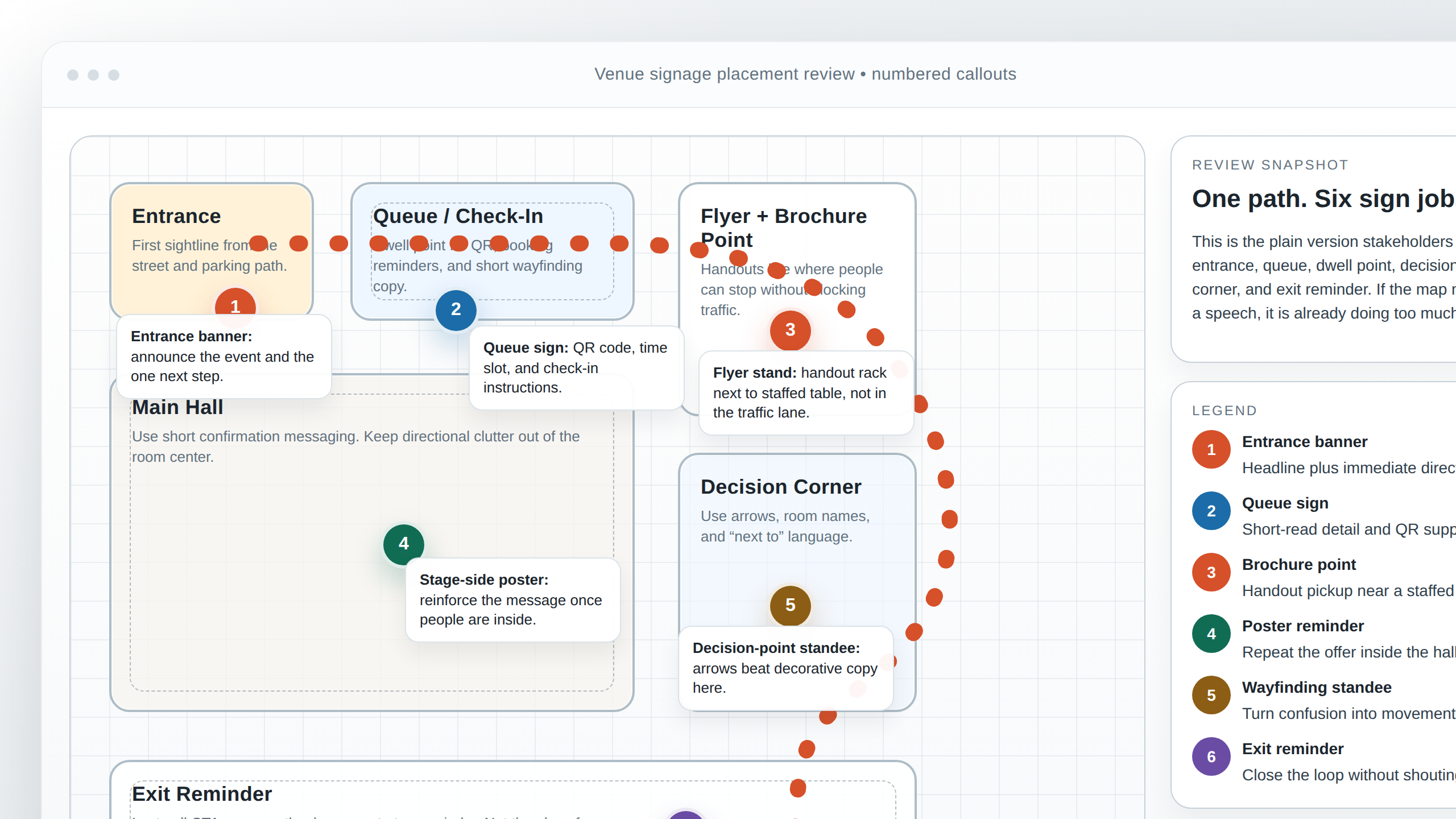
- Rendering style: if the campaign includes sketches or floor plans, keep the line weight and annotation style consistent.
The same logic applies when a radio spot is supported by print collateral. The listener cannot see the visuals, but the visual style often shapes the brand memory they carry into the next touchpoint. If the audio sounds calm and precise while the print looks hyperactive, the audience receives mixed cues. That is not versatility. That is drift.
If you need a second example of channel discipline, look at Think with Google’s Rain campaign example. The point worth borrowing is the coordination: the campaign adapts to another medium without losing the core message or the relationship between channels. Different surface, same decision.
Practical rule: if the photo style feels like a different brand from the headline style, fix the image direction before you keep refining the copy. Design problems love to disguise themselves as copy problems.
CTA alignment
The CTA is where most cross-media campaigns quietly fall apart. The radio says one thing. The print piece says another. The email, if there is one, adds a third version because apparently no one wanted the campaign to have a pulse. The remedy is simple: same offer, same timing, same action verb.
| Good alignment | Bad alignment | Why it matters |
|---|---|---|
| “Book by Friday for the launch offer.” | Radio: “this week”; print: “month-end special.” | The audience should not have to translate the deadline. |
| “Visit the studio on Saturday.” | Radio says visit; print says call; banner says scan. | Too many actions create hesitation. |
| “Ask for the campaign rate.” | One piece uses “offer,” another says “deal,” another says “promotion.” | Words change memory. Keep the action language stable. |
Timing matters as much as wording. If the radio spot says “from Monday,” the print piece should not bury the date in a corner and hope the audience has the eyesight of a hawk and the patience of a saint. Put the timing where the eye lands last, and repeat it once clearly.
My rule of thumb: if the CTA requires explanation, it is not a CTA yet. It is an administrative sentence wearing a costume.
Production handoff notes
Good handoff notes are boring in the best possible way. They make the project move. They also keep the designer, the copy lead, and the account person from inventing different versions of reality. I want the handoff to answer four questions without a meeting:
- What assets are approved? Logos, photos, audio files, product shots, maps, and any required disclaimers.
- What copy is locked? Headline, body copy, CTA, dates, contact details, and the exact wording that should not change.
- What formats are needed? Print sizes, radio durations, export specs, and delivery paths.
- What are the deadlines? Internal review date, client approval date, final production date, and release date.
I also recommend a single named owner for copy approvals. Not a committee. Not “whoever sees it first.” One owner. Approval ambiguity is just a polite way of scheduling a delay.
If you are working with the studio on a live project, the contact page should be the first clean handoff point. Use it for the brief, the files, and the final sign-off path instead of letting the campaign dissolve into a chain of forwarded messages.
Useful handoff checklist:
- Final script PDF and final layout PDF.
- Source files for print and audio versions.
- Approved logo files and font references.
- Image list with licenses or provenance notes.
- Signed-off CTA wording and dates.
- Delivery calendar with one owner per task.
Common failure points and quick fixes
Most campaign problems are not dramatic. They are small inconsistencies that multiply. The good news is that they are usually fixable before production if someone is willing to look at the whole system instead of the favorite asset.
| Failure point | What it looks like | Quick fix |
|---|---|---|
| Mismatched tone | Radio sounds lively; print sounds formal and distant. | Rewrite the headline and opening line so both pieces share the same emotional register. |
| Different offers | One asset promotes a discount, another promotes a date change. | Lock one offer first and refuse to make a second offer unless strategy demands it. |
| Inconsistent CTA | Radio says call; print says scan; a banner says visit. | Choose the lowest-friction action and use it everywhere possible. |
| Unreadable hierarchy | Everything is bold, large, and equally important. | Pick one dominant element, one support line, and one action point. |
| Image drift | Different crop, different lighting, different mood. | Build an image reference sheet before production begins. |
A quick review sequence helps. Read the radio script out loud. Then look at the print piece with the audio script beside it. If the words and the layout do not seem to be speaking the same language, they are probably not. That sounds obvious until you are in round three and everyone is pretending the problem is subtle.
Mini example walkthrough
Here is a conceptual campaign I would be comfortable sending into production: a weekend venue promotion for a new opening event. The goal is simple: attract attention, make the offer clear, and get people to act before the date passes. Same message, three formats.
Core message: “A new venue opening this weekend with a clear introductory offer.”
1) 20-second radio spot
Hook: “This weekend, something new opens with a reason to walk in.”
Benefit: “You get a simple launch offer, a fresh space, and a first look before the crowd settles in.”
Proof: “The team has designed the launch around easy access, fast service, and a clear welcome.”
CTA: “Come by Saturday and ask for the opening offer.”
The point is not the exact phrasing. The point is the structure. The script gives the campaign a pulse.
2) Flyer layout
The flyer carries the same core idea, but in print rhythm:
- Headline: “Opening This Weekend”
- Support line: “New venue. Introductory offer. Clear start date.”
- Proof line: One short sentence about the experience or service promise.
- CTA: “Visit Saturday” or “Reserve now,” whichever is the real decision point.
- Visual: One main image, not three competing ones.
3) Banner layout
The banner has less space, so it keeps the message compressed:
- One large headline.
- One line for the offer.
- One date or action.
- One contact or location cue.
The banner should feel like the radio spot paused long enough to be read at a glance. If the banner starts adding new information, it stops being a support piece and becomes a second campaign.
This is also where the logic of coordinated media matters. Think of the campaign as a set of decisions, not a stack of deliverables. The script decides the tone. The print piece decides the rhythm. The image language decides the memory. The CTA decides whether the audience knows what to do next. If all four decisions agree, the campaign feels intentional instead of assembled.
One more practical example: if the radio says “from Monday,” the flyer should say “from Monday” and the banner should say “from Monday.” Not “next week.” Not “starting soon.” Not “check in for details.” Clarity is cheaper than rescue work.
Conclusion
A radio-plus-print campaign works when it behaves like one system. The message stays stable. The radio spot gives it time and voice. The print piece gives it hierarchy and rhythm. The creative toolkit keeps the visual language honest. The CTA stays identical enough that nobody has to translate the offer in their head.
Key points to keep:
- Start with one core message and one repeatable phrase.
- Write the radio spot in a hook-benefit-proof-CTA structure.
- Mirror that pacing in print through headline size, spacing, contrast, and CTA placement.
- Lock typography, color, logo usage, and image style in a shared toolkit.
- Use the same offer, the same timing, and the same action language across formats.
- Hand off the campaign with clear assets, approvals, and deadlines.
If you want help turning one idea into a radio spot, a flyer, a banner, and the rest of the campaign system, review the services page, check the about page for background, and use contact when you are ready to move from planning to production. If you want more practical guides like this one, the blog is the right place to keep reading. The campaign should not need a translator. Neither should the handoff.