The Creative Brief Template We Use for Venue Campaigns (Print + Radio + Renderings)
A good venue campaign brief does not reduce creativity. It reduces avoidable confusion.
If you have ever watched a project drift because the banner size came by email, the copy came by chat, the radio note came as a voice message, and the rendering feedback arrived in a screenshot with no context, this article is for that problem. The practical question is simple: what belongs in one brief so the studio can produce print, radio, and renderings without spending half the project decoding fragments?
That is the reason this template exists. It is not meant to make the brief longer. It is meant to make the decisions visible before production starts. For image rights, the most basic guardrail is still the license question, which is why resources such as Creative Commons licenses are worth checking whenever a campaign uses third-party photos. For radio, compliance is not optional theatre; the FCC’s sponsorship identification guidance is a useful reminder that broadcast copy has rules as well as style.

What follows is a copy-paste brief structure, plus practical notes on how to fill it in. If you want the studio scope first, start with the services page. If you want examples of the kind of work this brief is designed to support, the portfolio is the fastest reference. If you need to contact the team after collecting your inputs, use the contact page. And if you want the broader site context first, the home page, about page, and privacy policy are all there for the usual reasons: scope, trust, and transparency.
Why one brief beats separate emails
Separate emails are convenient for the sender and expensive for everyone else. A venue campaign usually moves across several formats at once: a banner may need a headline and dimensions, a flyer may need a QR code and paper choice, a rendering may need a floor-plan source, and a radio spot may need a script, length, and pronunciation notes. When those details live in different messages, the project spends time reconstructing its own memory.
A single brief prevents three common failures:
- Miscommunication: one person assumes the campaign is about reservations, another assumes it is about awareness, and the copy ends up serving neither.
- Version drift: the approved offer changes after layout is already underway, which creates unnecessary rework.
- Rights and compliance mistakes: a photo is used before its usage rights are clear, or a radio line is written without checking what must be disclosed.
The rule is blunt: if a decision affects layout, timing, copy, or production, it belongs in the brief. Everything else can stay out. The brief should be the control document, not a scrapbook.
| Brief section | Decision it locks down | What it prevents |
|---|---|---|
| Campaign goal | What the campaign is for | Random copy and mixed priorities |
| Audience and offer | Who the message is meant to move | Generic messaging that tries to speak to everyone |
| Specs and placements | How and where the work will appear | Wrong sizes, wrong materials, wrong assumptions |
| Approval workflow | Who signs off and when | Late-stage reversals and blame by committee |
What to include at the top
The top of the brief should give the studio enough context to understand the job in one minute. Keep it short, but not vague.
- Campaign goal: spell out the outcome you actually want. “Promote a new dinner menu” is weaker than “drive Friday and Saturday dinner reservations for the next six weeks.”
- Venue or location: identify the site, room, or entrance the work is for. A foyer banner and a street-facing banner do not carry the same message burden.
- Key dates: include first draft, proof review, final approval, print deadline, delivery date, install date, and campaign end date if there is one.
- Decision-makers: name who can approve design, copy, and final output. If three people can veto the same work but only one can approve it, say so up front.
A practical rule: every line at the top should answer one of four questions. What is this for? Where is it going? When does it need to be ready? Who owns the yes?
Top-of-brief field guide
| Field | What to write | Why it matters |
|---|---|---|
| Project name | Use one stable campaign name | Prevents file mix-ups later |
| Goal | One sentence with a measurable outcome | Keeps copy and design aligned |
| Location | Venue, room, entrance, or placement zone | Changes visibility and content priorities |
| Date range | Start, live date, and expiry | Defines urgency and production order |
| Approver | Name and role | Stops the approval chain from becoming a guessing game |
Download the template
Download the creative brief template (.txt). If you prefer to work inline, copy the structure below and fill it in before you send anything to the studio.
Creative Brief Template for Venue Campaigns

Project overview
- Campaign goal:
- Venue/location:
- Primary audience:
- Key dates:
- Decision-makers:

Brand and assets
- Logo files:
- Font references:
- Color references:
- Approved photos:
- Usage rights or licensing notes:

Audience and offer
- Who this is for:
- Main message:
- Call to action:
- Offer details:
- Legal or compliance notes:

Print and placement specs
- Banner sizes and quantities:
- Flyer sizes and quantities:
- Brochure format and folds:
- Material or finish notes:
- Placement details:

Renderings and floor plan inputs
- Reference photos:
- Dimensions:
- Must-show elements:
- Perspective preferences:
- Labeling or callout notes:

Radio section
- Station and airtime context:
- Spot length options:
- Tone reference:
- Voice preferences:
- Pronunciation notes:
- Approval requirements:

Production constraints
- Hard deadline:
- Proofing steps:
- File delivery format:
- Version naming:
- Final handoff details:

Approval workflow
- First reviewer:
- Final approver:
- Revision rounds:
- What counts as final:
- Backup contact:
Brand & assets section
This section is where a campaign becomes consistent instead of merely busy. The studio needs the assets that define the brand, plus the rules for using them. The point is not to collect every file in the archive. The point is to reduce interpretation.
- Logos and usage: include preferred versions, minimum size notes, spacing rules, and any “do not use” variants.
- Fonts and color references: list names, weights, and any brand-approved colors in a usable format. If the brand has both print and digital palettes, say which one governs the current campaign.
- Photo sources and rights: identify whether images are original, stock, customer-provided, or from a licensed library. If the rights are not clear, the asset is not clear.
Practical example: if the venue wants a banner, a flyer, and a brochure to feel like one campaign, the logo lockup, headline style, and color treatment should be fixed before layout starts. Otherwise the result may be technically correct and visually forgettable. That is an efficient way to spend money badly.
When you are checking assets, keep the rights question as visible as the design question. The Creative Commons licensing page is not a legal substitute, but it is a sensible reminder that image permissions are part of the brief, not an afterthought.
Audience & offer
This is usually the section that gets flattened into a sentence and then blamed for weak results later. Do not write “everyone” unless your real audience is a queue with no memory. The more specific the audience, the better the message discipline.
Questions this section should answer
- Who is the campaign for?
- What problem or desire is the message addressing?
- What is the main offer, and what is the call to action?
- What must not be said, promised, or implied?
For venue campaigns, audience detail often changes the entire creative direction. A campaign for families needs different cues than a campaign for late-night visitors. A promotion built around a fixed-price offer needs different hierarchy than a promotion built around atmosphere or convenience.
A useful rule is to define the audience in one sentence, the offer in one sentence, and the CTA in one short line. If the CTA has to do too much work, the design will look crowded. If the audience is too broad, the offer will sound average. That is not a design problem so much as a decision problem.
If the brief touches regulated claims, discounts, age limits, or broadcast wording, add the note here rather than burying it in comments. For radio spots, the FCC sponsorship identification guidance is a reasonable reference point whenever disclosure or attribution becomes part of the script.
Specs & placements
Specs turn a campaign from abstract intent into deliverable work. The studio cannot guess the material, size, or placement and still be responsible for the outcome. This section should be unambiguous.
| Format | What to specify | Typical mistake |
|---|---|---|
| Banner | Width, height, material, finish, and mounting location | Sending only the headline and calling it “large” |
| Flyer | Size, quantity, side count, and distribution point | Forgetting whether the flyer is handout or rack display |
| Brochure | Fold type, page count, trim size, and paper choice | Approving copy before the panel order is known |
| Rendering | Output size, view angle, labels, and any fixed floor-plan dimensions | Providing a sketch without scale or reference points |
| Radio spot | Length, station context, voice style, and deliverable format | Writing a 30-second script that reads like 45 seconds |
Placement matters as much as format. A banner at an entrance has a different job from a poster at a queue point. A flyer near a staffed desk can afford a different amount of detail than a flyer handed out in motion. In other words, the medium is not a delivery detail. It is part of the message.
If you need a reminder of how visual hierarchy affects reading order, established design references such as the Nielsen Norman Group’s writing on hierarchy and scanning patterns are useful. The point is simple: the eye needs an obvious first read, not a philosophical journey.
Renderings & floor plan inputs
Renderings and floor plans should not be treated like decorative extras. They are decision tools. Their job is to show where something goes, what it will look like at a glance, and which elements are fixed versus open to interpretation.
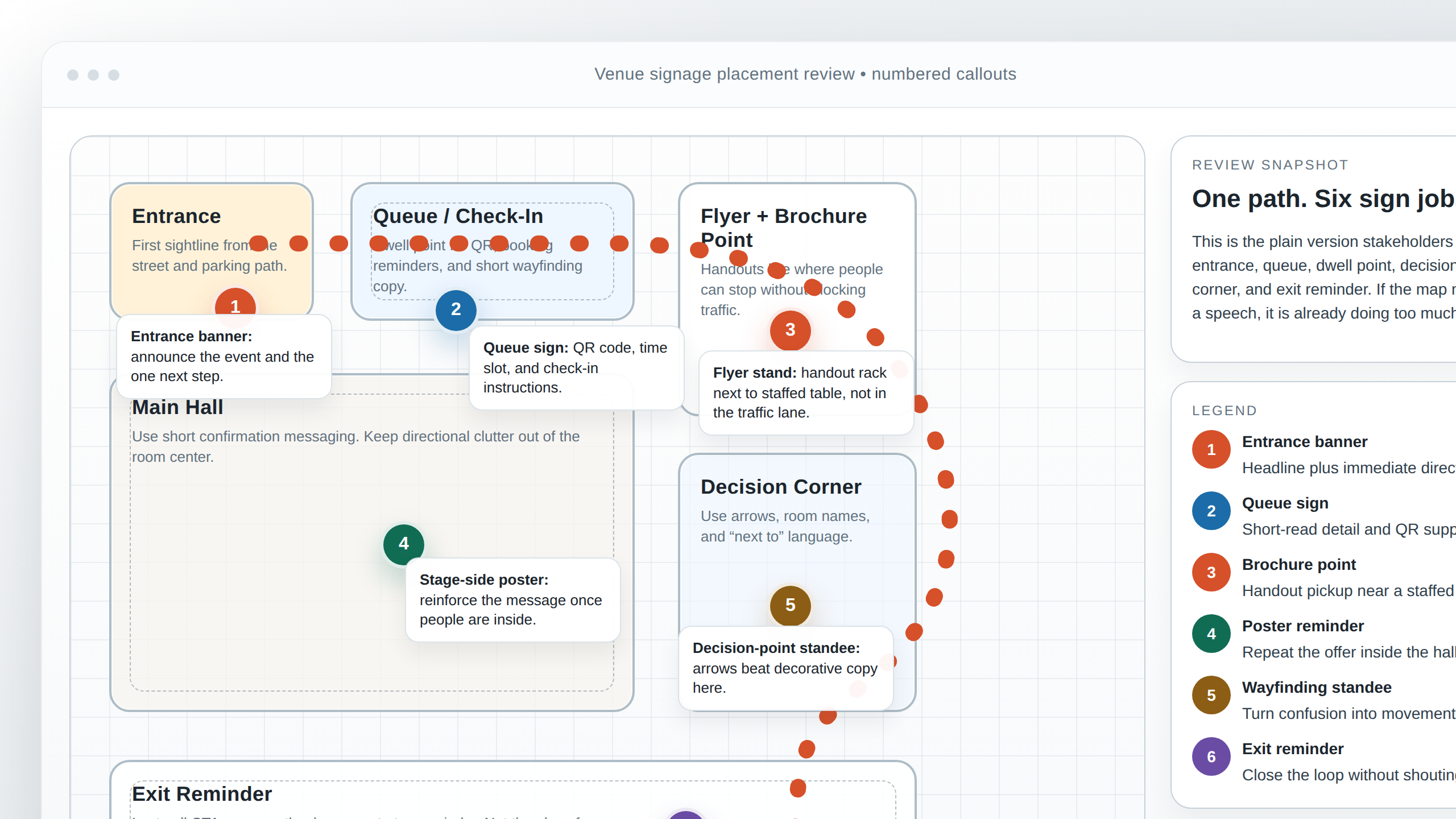
What the studio needs here
- Reference photos: include the space, the entrance, the wall, or the queue area being modeled.
- Dimensions: give actual measurements, not guesses. A rendering that looks right on screen can still fail on a wall if the scale is wrong.
- Must-show elements: note what has to appear in the visual, such as logos, wayfinding arrows, callout labels, or the exact product names.
- Perspective preferences: specify whether the view should feel front-on, angled, elevated, or close to eye level.
Good inputs save revision cycles because they remove ambiguity early. Bad inputs make every comment sound larger than it is. If the rendering is meant to help a venue decide between placement options, say that clearly. If it is meant to show the final look for internal approval, say that too. The same image can serve different purposes, but only if the brief says which one matters.
When the layout involves signage placement, the best annotations are plain language labels, arrows, and simple numbered callouts. No one needs an essay on the floor plan. They need to know where the eye should go, what the sign is supposed to do, and what must remain visible.
Radio section
Radio is where a brief can look complete and still fail if it ignores timing. Unlike print, a script has to fit inside a fixed duration and sound natural when spoken. The brief should therefore answer both the message question and the performance question.
What to specify for radio
- Station and airtime context: note whether the spot is for morning drive, midday, or evening listening. That changes pacing and tone.
- Length options: say whether the spot must fit 15, 30, or 60 seconds, and whether alternate cuts are required.
- Tone reference: describe the intended feel in practical language: warm, direct, urgent, premium, conversational, or upbeat.
- Voice and recording expectations: mention accent, gender neutrality if relevant, pronunciation notes, and whether a scratch read or polished read is expected.
- Compliance notes: include disclosures, offer terms, age limits, or anything that has to be read exactly.
A useful test is to read the script aloud before approval. If it sounds too long in a normal speaking voice, it is too long. If the key offer disappears in the middle of the read, the hierarchy is wrong. If the CTA feels pasted on, the script was written as copy instead of audio.
For a quick refresher on the format’s constraints, the Wikipedia overview of radio advertising is basic, but it reminds you that spoken media has to do different work than print. The main difference is not just duration. It is memory.
Production constraints
This is the section that keeps the project honest. A campaign can have a strong concept and still miss the calendar if the deadlines are not written down. Production constraints should be explicit, not implied.
- Deadlines: list internal approval deadlines, print deadlines, delivery dates, and install dates separately.
- Proofing steps: say who reviews the first proof, what kind of changes are allowed at each stage, and what counts as a major revision.
- File delivery formats: specify the final formats required for print and broadcast, plus any source files that should be handed over.
- Version naming: define how files should be labeled so the final sign-off is not mistaken for an early draft.
This section is where a studio can protect the schedule without becoming rigid. The goal is not to punish late input. The goal is to make the consequence visible. If the final approval arrives after the print deadline, the result is not a mystery. It is a delay.
Practical tip: do not list “ASAP” as a deadline unless you enjoy discovering how wide that word can stretch. Use a date and a time. Humans love ambiguity until it costs them money.
Approval workflow
Approval should never be a social performance. It should be a defined process. The brief should answer three things: who reviews first, who gives the final yes, and how many revision rounds are included before the job is considered final.
| Workflow item | What to state | Reason to include it |
|---|---|---|
| First reviewer | Name or role that checks the initial draft | Prevents comments from arriving in three directions at once |
| Final approver | The person who can close the loop | Avoids last-minute reversals |
| Revision rounds | How many are included | Protects the schedule and the budget |
| Definition of final | What changes are still allowed after sign-off | Stops “final-final-v3” from becoming a management style |
One useful discipline is to separate content approval from production approval. A client may approve the wording but still need one more technical check on bleed, crop, or delivery format. That distinction saves avoidable rework.
How to fill the template effectively
There are only a few practical rules here, but they matter more than fashionable process language.
- Write decisions, not vibes. “Premium but friendly” is not enough. Say what premium means in this campaign: darker palette, fewer words, higher contrast, calmer motion, or a specific tone of voice.
- Use one owner per field. If nobody owns the CTA, it will evolve in the margins until no one recognizes it.
- Separate facts from preferences. A banner size is a fact. A preferred headline style is a preference. Mixing the two makes revisions harder to assess.
- Keep one source of truth. When the same measurement appears in three different places, one of them is usually wrong.
- Treat unclear assets as missing assets. If a photo’s license cannot be confirmed, do not assume it is safe to use.
If you want a simple rule for the creative team, use this: the brief is ready only when a designer, a copywriter, and a producer can all use it without asking the same three questions again. That is the test. Not elegance. Not length. Usability.
For practical context, you can think of the brief as a traffic map for the project. The goal is to show where the work is going, what each format is supposed to carry, and who is responsible for the final turn. The less the team has to guess, the less the project has to pay for guesswork.
Conclusion
A strong venue campaign brief is not administrative overhead. It is the cheapest place to resolve expensive problems. If the goal, audience, assets, specs, placement, radio constraints, deadlines, and approvals are all written down once, the studio can spend its time producing the work instead of reconstructing the request.
If you are preparing a new campaign, start with the downloadable template, fill in the top section first, and then move through the rest in order: brand assets, audience and offer, specs, renderings, radio, production constraints, and approval workflow. That sequence is deliberate. It mirrors the way decisions tend to break in real projects.
When the brief is complete, send it with any supporting files and keep the version stable. Then the studio can do the part that actually requires judgment.
- One brief beats fragmented emails.
- Top-of-brief clarity prevents the most common errors.
- Specs and placements should be explicit, not implied.
- Renderings and radio spots need their own inputs.
- Approval workflow should be written before revisions begin.