
How to Prepare Artwork Files for Printers: PDF Preflight Checklist (Fonts, Bleed, Images, and Proofing)
Most print problems are not creative failures. They are handoff failures: a font that did not embed, a background that stopped at the trim edge, an image stretched past its real resolution, or a proof approved too quickly. A short PDF preflight routine usually catches those problems before they become reprints.
If you are sending artwork to a printer, the same questions tend to appear every time: is this PDF actually print-ready, are the fonts safe, how much bleed is enough, what counts as acceptable image quality, and what exactly should be approved on the proof? Those are sensible questions. They are also cheaper to answer before the file leaves your desk.
This guide is a practical preflight checklist for studio teams, in-house marketers, and clients preparing final artwork. It explains what “print-ready” means in plain terms, what to check before export, what to check after export, and where small technical mistakes usually hide. For broader studio context, the home page, Services, and About pages show how AMV Network approaches production-aware design work.
What “Print-Ready” Actually Means
Print-ready does not mean “looks good on screen.” It means the PDF contains the information and structure a printer needs to output the piece reliably: correct page size, bleed where required, safe placement of important content, embedded or controlled fonts, images that hold up at final size, and export settings that do not quietly damage the file.
In practice, many printers prefer a PDF because it preserves layout more predictably than editable working files. Where a printer asks for a specific PDF/X workflow, it is worth following that request rather than improvising. The PDF/X overview is a useful plain-language reference if you need a quick refresher on why print workflows often ask for that family of standards.
| Print-ready element | Why it matters | Common failure |
|---|---|---|
| Correct page size | The printer outputs the job at the intended dimensions | Exporting the wrong artboard or scaling on export |
| Bleed and trim setup | Edge-to-edge backgrounds survive trimming | White slivers or cropped borders |
| Embedded fonts | Text keeps its intended shape and spacing | Font substitution or reflow |
| Suitable images | Photos and graphics stay clean at final size | Soft, pixelated, or over-compressed output |
| Proof approval | Someone checks the exported PDF, not just the design file | Last-minute surprises after approval |
The useful takeaway is simple: a file is print-ready when it is predictable. The printer should not need to guess what you meant.
Quick Preflight Workflow: Before You Export, Then After You Export
The fastest reliable workflow has two passes. One happens inside the working file. The second happens on the exported PDF.
Before export
- Confirm final size and orientation. Check the actual finished dimensions, not the dimensions you remember from the first brief.
- Confirm bleed and safe margins. Extend backgrounds beyond trim and move critical text inward.
- Audit linked assets. Replace missing images, outdated logos, and weak photos before export.
- Review fonts and styles. Make sure type is intentional, consistent, and available for embedding.
- Check color intent. Know whether the printer wants CMYK output, spot colors, or a specific profile-driven workflow.
After export
- Open the PDF and zoom to the edges. This catches missing bleed, clipped objects, and trim-line surprises quickly.
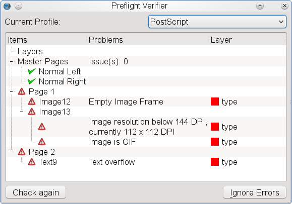
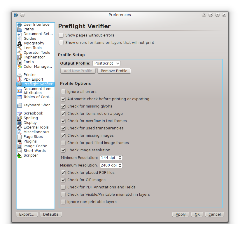
- Inspect the document properties or preflight panel. Look for font warnings, image downsampling, transparency flags, or profile mismatches.
- Read small text at realistic zoom. Fine print, phone numbers, URLs, and disclaimers deserve a skeptical review.
- Check page order and versions. Multi-page brochures and booklet files are especially vulnerable here.
- Approve from the exported PDF, not from memory. That is the version the printer will use.
If the job is important enough to print, it is important enough to open twice.
Fonts: Embedding, Subset vs Full, and How to Spot Missing Fonts
Fonts cause a disproportionate share of avoidable problems because the design can look perfect on one machine and change the moment the file moves. The safest route is to embed fonts in the PDF whenever licensing and workflow allow it.
Embedding means the font data needed to render the text travels with the PDF. Subsetting means only the characters used in the document are embedded. Full embedding includes the whole font. In many normal print jobs, subsetting is fine and keeps the file smaller. Full embedding can help when a workflow expects later edits or complex character coverage, but that depends on the project and the font license.
What matters most is not winning a technical argument about subsets. It is avoiding substitution.
- Look for warning icons or missing-font notices before export. Fix them in the source file, not after the PDF is created.
- Review unusual characters. Currency symbols, accented names, fractions, and bullet characters are often where trouble first appears.
- Do not mix manual bold or italic styling with real font styles carelessly. Faux styles can export unpredictably.
- If a printer asks for outlined text for logos or headlines, duplicate the file first. Keep an editable version with live text for future changes.
A quick sign that something went wrong is text reflow: lines wrap differently, bullets shift, or a neatly aligned block suddenly looks crowded. That is usually a font problem until proven otherwise.
Bleed and Trim: Set the File for the Blade, Not for the Monitor
Bleed is extra artwork that extends beyond the trim edge. Trim is the final cut line. Safe area is the inner zone where important content should stay. Those three concepts work together. A file without bleed can still look correct on screen and still fail on press.
The exact bleed amount depends on the printer and product, so confirm the spec rather than guessing. What rarely changes is the logic:
- Backgrounds, photos, and color blocks that reach the edge must extend beyond the trim.
- Logos, headlines, QR codes, and contact details should sit comfortably inside the safe area.
- Thin borders near the edge are risky. Small trim movement makes them look uneven quickly.
- Crop marks are not a substitute for bleed. They only show where trimming should happen.
The crop marks reference is useful if you want a quick explanation of trim marks and how they relate to final finishing. The practical rule, though, is simpler: do not trust the visible page boundary in your layout as the full story.
Images: Resolution Targets, Color Mode, and Low-Res Traps
Images need to be judged at their final printed size, not at thumbnail size in a layout palette. That is where many low-resolution uploads survive too long. They look fine in a narrow preview, then fall apart when stretched across a brochure cover or banner panel.
| Use case | Typical target | What to watch |
|---|---|---|
| Flyers, brochures, business cards | Around 300 ppi at final size | Soft photos, screenshots dropped into print layouts, over-compression |
| Posters and medium-format signs | Often lower than 300 ppi is acceptable, depending on viewing distance | Assuming “large format” excuses a weak source image |
| Large venue graphics and banners | Ask the printer for the effective-resolution target they expect | Scaling tiny web images far beyond their real capacity |
Color mode matters too. Screen images are usually prepared in RGB, while print workflows often expect CMYK or a defined conversion process. The Adobe guide to color conversion and ink management is a practical reference if you need to review how output conversion affects PDFs. For a simpler background refresher, the CMYK color model overview explains why bright on-screen colors often shift when prepared for print.
Useful checks here:
- Check effective resolution at final scale. Not at 25%, not in a thumbnail grid.
- Avoid screenshots unless the job genuinely needs a screenshot. Web screenshots are a common source of soft print output.
- Ask before converting brand-critical colors. Some jobs need a more controlled workflow than a default export preset.
- Review image compression in the exported PDF. An image can start strong and leave the export weak.
Overprints and Transparency: Quiet Problems with Loud Consequences
Overprint and transparency problems are not always obvious on screen. That is part of the danger. A black object set to overprint may behave exactly as intended, or it may interact badly with underlying colors depending on the object, color values, and output setup. Transparency effects can flatten cleanly, or they can produce banding, seams, or dull color transitions when exported poorly.
The safest approach is conservative:
- Do not leave overprint settings in place unless you know why they are there.
- Review drop shadows, glows, opacity effects, and blending modes in the exported PDF.
- Check dark text over tinted backgrounds closely. Small overprint mistakes often hide there.
- When in doubt, ask the printer which PDF preset they want. Many output issues begin with a vague export decision.
The overprint reference is worth a quick read if the term is unfamiliar. You do not need to become a prepress specialist to benefit from the warning: invisible settings can still change visible output.
Spot Checks That Catch Most Problems
Full technical preflight tools are useful, but a disciplined visual review still catches a large share of mistakes. The following checks are simple and effective:
- Zoom to all four corners. Verify bleed, trim behavior, and anything sitting near the edge.
- Read the smallest text. Terms, contact details, URLs, and legal lines should still feel intentional.
- Check black objects. Make sure small black text looks crisp and not suspiciously rich or tinted.
- Scan image-heavy pages at 100% and above. This reveals softness and compression artifacts quickly.
- Check page order. Especially for folded pieces, duplex files, and multi-version exports.
- Compare the PDF to the brief. Wrong phone number, wrong version, wrong offer, and outdated logo are still preflight failures.
These are the checks that cost minutes and save days.

Proofing Process: What to Approve, and What to Send Back
A digital proof is not the moment to keep “just trusting the process.” It is the moment to verify the file you are actually approving.
Approve the proof when:
- The content is correct. Names, dates, addresses, prices, contact details, and page order are final.
- The layout is stable. Margins, trim behavior, spacing, and hierarchy feel resolved.
- The images are acceptable for the intended size.
- The color expectations are realistic for the output method.
- You understand any printer-specific notes. For example, paper, finish, substrate, or finishing constraints.
Send the proof back when:
- text is too close to the trim or fold
- images feel soft or mismatched
- fonts look inconsistent or substituted
- the wrong version was exported
- the proof raises unanswered color questions
A clear proofing note is more useful than a vague “please fix.” Identify the page, the object, and the issue. That reduces one more round of avoidable interpretation.
File Naming and Handoff Basics
Handoff mistakes are not glamorous, but they waste time all the same. If the printer receives three files called final.pdf, final-v2.pdf, and final-really-final.pdf, the workflow is already wobbling.
A steadier naming pattern looks like this:
client-project-piece-size-version-date.pdf
Example: amv-event-brochure-a4-v03-2026-06-11.pdf
Include these points in the handoff email or shared folder note:
- final file name
- finished size
- bleed included or not
- number of pages or sides
- special notes such as fold, lamination, mounting, or spot-color requirements
- approval status so nobody guesses which file is current
If you want the studio to sanity-check a file before it goes out, the Contact page is the cleanest next step. If you want more related resources first, the blog is the right index.
A Copy-Paste Final PDF Checklist
- Page size correct: yes / no
- Bleed added where required: yes / no
- Important content inside safe area: yes / no
- Fonts embedded or intentionally outlined: yes / no
- Images acceptable at final size: yes / no
- Color workflow confirmed with printer: yes / no
- Overprint and transparency checked: yes / no
- Proof reviewed from the exported PDF: yes / no
- File name and version clear: yes / no
- Approval note sent with the correct file: yes / no
The final check is not a ritual. It is quality control. When the PDF is predictable, the print job is easier for everyone downstream.