A Simple Guide to Floor Plan Graphics for Events, Shops, and Venues
Floor plans don’t sell space by themselves-clear floor plan graphics do.
If you’ve ever wondered What should a floor plan actually show?
How do I label areas so visitors don’t get lost?
What details help staff move faster?
and Why does a plan look clear on screen but confusing on paper?
-this guide is for you. According to accessibility guidance, meaningful labeling and clear visual hierarchy help people understand information more reliably (see W3C WAI accessibility overview?utm_source=amvnetwork.com). And in print workflows, providers stress using the right exports and keeping critical information inside safe margins so content survives trimming and production (see Adobe’s notes on PDF/X print concepts?utm_source=amvnetwork.com).
In this article, you’ll learn what information belongs on a floor plan graphic, how to add labels/icons/directional cues that are easy to scan, how to simplify busy layouts, and what to check before client approval-so your plan works for marketing, wayfinding, and internal planning.
As a starting rule: a floor plan graphic should answer one job quickly-“Where is what, and how do I get there?”
Table of contents
1) When a floor plan is useful in marketing
A floor plan is more than an architectural picture. In event and shop contexts, it becomes useful when it helps someone make a decision or take a next step.
- Promotions that need orientation: craft fairs, conferences, pop-up shops, shopping malls, and multi-tenant venues where visitors need to find entrances, booths, or departments.
- Staff coordination: staff maps for queue lines, pickup points, staging areas, or “who does what where” during the event day.
- Operational clarity: emergency-route awareness (presented at a “wayfinding level,” not as technical code drawings), loading areas, and back-of-house circulation.
- Multi-format consistency: a single plan graphic style that can be reused across a website, printed handout, and on-site signage.
If you’re also planning other venue creatives, pair the plan graphic with a clear conversion path-your message can start on banners and continue through the plan. Explore services for how venue materials fit together, or view examples in portfolio.
2) Labels, icons, and directional cues
Good labeling is the difference between a plan that’s “technically correct” and a plan that’s actually usable.
Label zones first, then details
Start with the biggest navigational questions:
- Entrances/exits: Use simple text labels (e.g., “Main Entrance,” “Exit”) or consistent directional markers.
- Primary areas: Name the zones visitors care about (e.g., “Registration,” “Stage,” “Food,” “Shop A”).
- Secondary items: Add room/booth numbers or small detail labels only when the visitor journey requires it.
Use an icon system people can learn quickly
Icons help scan faster than small paragraphs. Keep the icon set small and consistent:
- Facility icons: restrooms, accessibility access, information desk.
- Service icons: ticketing, bar, pickup, Wi‑Fi (if relevant).
- Activity markers: stage, demo area, workshop.
Tip: include a mini legend (even 4-6 items) so the plan doesn’t rely on guesswork.
Add directional cues without clutter
Directional cues should guide the eye for the main path(s):
- Arrows for “follow this line” moments: entrances → registration → main floor, or lobby → restrooms.
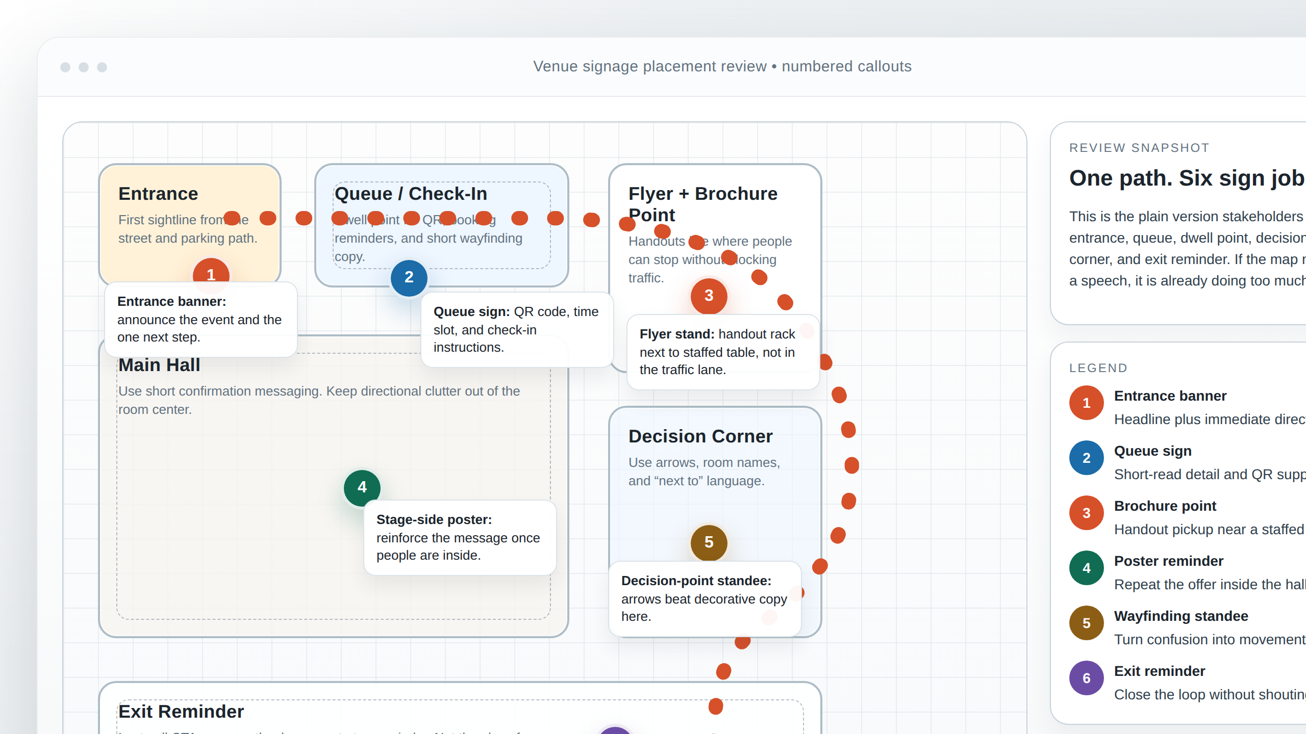
- Numbered callouts: “1 Registration, 2 Stage, 3 Food” when the visitor reads from a list.
- Highlighting: emphasize the highlighted route (one color for the journey) and keep everything else neutral.
3) How to simplify complex spaces
If the plan feels dense, the fix is rarely “more detail.” Most of the time, it’s better prioritization.
Choose a “purpose view”
A single floor plan can’t perfectly serve every use case. Decide which job the graphic is designed for and simplify accordingly:
- Visitor view: entrances, key areas, wayfinding routes, and must-find services.
- Vendor view: booth locations, loading zones, rules-of-thumb for access, and pickup points.
- Operations view: back-of-house circulation, staging, staff stations, and communication nodes.
Reduce background noise
When walls, doors, and furniture clutter the canvas, visitors stop reading. Consider:
- lightening or de-emphasizing non-essential details (so labels stay readable),
- grouping small rooms into broader zones when they aren’t central to navigation,
- using fewer line weights (consistent thickness helps the eye).
Use “layering” in your design thinking
Even if the final output is one image, plan it as layers:
- Base geometry (walls/overall shape)
- Wayfinding layer (highlighted route, arrows, entrances)
- Info layer (labels + legend)
- Optional detail layer (booth numbers or extra points)
That layering makes it easier to produce multiple exports (website, poster, and printed handout) without redrawing from scratch.
4) Common readability problems
These are the problems that show up after printing, during crowd flow, or when someone is reading from a phone at an awkward angle.
Text that’s too small after scaling
If a plan is designed for a large monitor but printed on a smaller sheet, labels often become “almost readable.” A practical approach is to test readability at common sizes (e.g., the actual poster size your venue will print).
Low contrast between text and walls
Light gray labels on light backgrounds are a classic failure mode, especially under glare. Prioritize contrast for labels and legends first.
Too many label types
If you mix arrows, icons, numbers, and tiny text paragraphs all at once, the plan becomes a puzzle. Choose one dominant structure:
- either labels + legend,
- or numbered callouts + list,
- or a highlighted route + simple labels.
Inconsistent typography
When different fonts or sizes appear for similar things (e.g., “Entrance” label vs “Exit” label), visitors lose trust in the map’s system. Use one type hierarchy.
5) Checklist for client approval
Before sign-off, run a short checklist. This prevents last-minute “can’t you just move that label?” loops.
| Check | What “good” looks like | Fix if not |
|---|---|---|
| Goal match | Visitors/staff can answer “Where is X and how do I get there?” | Re-rank what gets labeled first; reduce secondary details |
| Legible at real size | Labels read after scaling/printing | Increase minimum font sizes; simplify label content |
| Legend consistency | Icon meaning is clear and matches labels | Update legend; standardize icon set and label placement |
| Wayfinding cues | Arrows/highlights guide the primary route without clutter | Reduce competing arrows; emphasize one route |
| Safe placement (trim/print) | Nothing critical is too close to edges; plan survives production | Move critical elements inward; use printer-safe margins/bleed |
| Version control | Clear naming for each use (web vs print, hall A vs hall B) | Use one naming convention for each export type |
Two quick external references for best practices: For accessibility principles around readability and structure, see W3C WAI. For print workflow concepts and exporting considerations, review Adobe’s PDF/X concept.
When you’re ready to align the plan graphic with your venue branding, send your preferred formats (web poster, A4 handout, wall signage) and the key locations that matter most. Start with contact and we’ll help you plan the deliverables.
Conclusion
A simple floor plan graphic is a prioritization exercise: pick the purpose view, label zones and essentials first, use a small icon system, and add directional cues that match how people actually move. Then verify it in context-at the sizes and surfaces where it will be read.
Key takeaways:
- Use floor plans for orientation: marketing, wayfinding, and internal coordination.
- Label with a clear hierarchy: zones first, details second.
- Keep icons/legend small: fewer symbols, better scanability.
- Simplify background noise: de-emphasize non-essential detail.
- Approve with a checklist: readability, legend consistency, cues, safe margins, and version control.