The Importance of Consistency Across Advertising Formats
Consistency isn’t a design style. It’s the shortest path between “I saw it” and “I trust it,” no matter where your audience encounters your brand.
If you’ve ever redesigned a banner, refreshed a brochure, and still felt like customers “didn’t quite get it,” these are the questions you’re probably asking:
- What does brand consistency actually mean across channels?
- Why does it matter in advertising performance-beyond aesthetics?
- How do you keep messaging aligned when every format has different constraints?
- What mistakes quietly break consistency?
According to the American Marketing Association and guidance on building reliable brand assets, consistency helps audiences recognize and evaluate brands faster. The underlying logic is straightforward: people build trust through repeat exposure to coherent cues, not through constant reinvention. (See Brand for background.)
In this article, you’ll get a practical framework to keep a unified brand message across banners, brochures, venue signage, renderings, and radio-plus examples of what “good” looks like and the common errors that cause brand drift.
What is brand consistency?
Brand consistency means your audience repeatedly experiences the same core signals-your promise, tone, visual system, and key information-no matter the advertising format.
In practice, consistency isn’t about using one template forever. It’s about keeping the same “brand logic” while adapting to constraints like size, viewing distance, print method, and audio-only messaging.
Consistency includes more than colors
- Message consistency: the offer, value proposition, and call-to-action remain aligned.
- Visual consistency: logo usage, typography, layout structure, and photo/illustration style match.
- Verbal consistency: tone of voice, terminology, and phrasing stay recognizable.
- Info consistency: dates, locations, pricing qualifiers, QR destinations, and contact details don’t conflict.
Why it matters in advertising
When your brand message is consistent across channels, you reduce cognitive friction. People can identify you sooner, remember you longer, and act with less uncertainty.
1) Faster recognition
Audiences often encounter venue advertising in fragments: a banner at the entrance, a brochure in the waiting area, and a short radio spot during commute time. Consistency makes those fragments snap into one familiar whole.
2) Higher credibility signals
Brand drift (different offers, conflicting CTAs, changing tone) can feel like uncertainty. Consistency turns your marketing into a dependable reference point-especially important for local businesses where trust is the conversion multiplier.
3) Better recall when formats differ
Banners and flyers are visual-first. Radio commercials are audio-first. Signage is often viewed at a distance and under distracting conditions. Consistency ensures each format reinforces the same story, not a random subplot.
Techniques for maintaining consistency across formats
Consistency is easier when you treat it like a production system, not a design preference. Here are practical techniques that work in real studios and small teams.
1) Create a “single source of truth” message sheet
Before any artwork starts, document:
- Primary offer: what you’re promoting.
- Target action: book, visit, call, reserve, buy, request, etc.
- Key proof: one or two credible supporting points.
- Core wording: the exact headline/phrase variants you want repeated.
- CTA behavior: what happens next (website, QR, phone, reception desk).
- Legal/qualifiers: any conditions that must appear consistently.
Then require every format to map back to this sheet. If something can’t, it becomes an explicit decision-not an accidental mismatch.
2) Build a modular creative system (not isolated designs)
Instead of reinventing each format from scratch, use modular rules:
- Logo rules: placement, minimum size, clear space, and background handling.
- Typography rules: headline vs body hierarchy, and minimum readable sizing.
- Layout pattern: a repeatable order of elements (headline → proof → CTA → contact).
- Photo style: lighting, framing, and whether images are candid vs staged.
This keeps banners, brochures, and signage from drifting into different “brands” as they evolve.
3) Apply “format translation” rules
Each advertising format has unique constraints. Your job is translation, not repetition. Use format-specific rules like:
- Banners: headline must be legible at distance; CTA should be simple; fewer words, stronger hierarchy.
- Brochures: expand proof and clarity; keep the same offer phrasing and ordering of benefits.
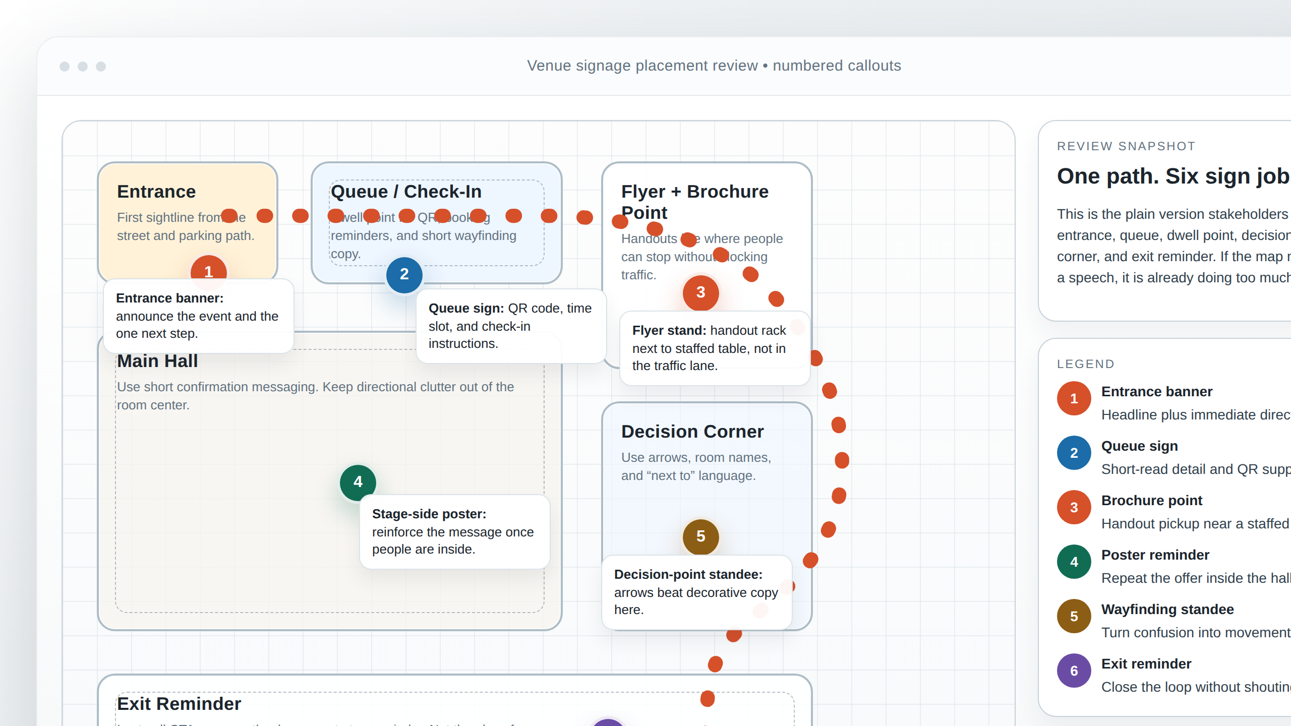
- Venue signage: align directions and QR destinations with the same action you promote elsewhere.
- Renderings and visuals: ensure the scenes match your real environment messaging (e.g., entrances, wayfinding, service areas) rather than generic mood shots.
- Radio: repeat the same value proposition and CTA behavior; avoid introducing new offers that aren’t in print.
4) Lock key assets and version them like inventory
Consistency breaks when teams reuse “almost right” files. Treat core assets as controlled inventory:
- Logo variants (light/dark, stacked/horizontal)
- Brand photos and approved retouch levels
- Icon set style rules
- CTA URLs/QR targets and their landing page alignment
Use a simple naming convention and keep one latest version approved for each core asset.
5) Set an approval checklist for every format
Before anything goes to print (or broadcast), confirm these “consistency gates”:
- Same offer: no silent rewrites.
- Same CTA: action and next step match across channels.
- Same contact details: phone, email, address (if used), and QR destination.
- Same tone: words sound like the same brand, not a different voice.
- Readable hierarchy: the main message is the most prominent element.
Examples of brands that excel in consistency
You don’t need to copy a famous company to learn the pattern. The lesson is how they keep one brand system coherent while adapting the execution.
Example 1: Consistent “offer framing”
Many global brands keep the same promise statement even when formats change. The brochure may add details, but the headline logic stays recognizable. The banner doesn’t contradict what the website says, and the radio spot doesn’t introduce a different deal.
Example 2: Consistent visual architecture
Brands that excel often use the same layout rhythm: headline first, proof next, CTA last-adjusting for the constraints of each channel. That architecture makes recognition predictable.
Example 3: Consistent photo direction
When a brand’s photography style stays steady-lighting, composition, and subject framing-audiences read new ads as “belonging” to the same organization, even if the campaign changes.
If you want a closer look at how advertising assets come together, browse the portfolio for real venue-focused examples and common production patterns. For the overall studio approach and how projects are organized, see the about section.
Common mistakes to avoid
- Rewriting the offer per format: even small phrasing changes can create doubt or confusion.
- Changing the CTA destination: QR or URL mismatches break the reinforcement loop.
- Different brand tones: one channel sounds formal, another sounds casual-audiences interpret that as inconsistency in identity.
- Overstuffing one format: if a banner becomes a brochure, the message hierarchy fails and the brand “looks unfocused.”
- Uncontrolled asset versions: old logo files and outdated contact details sneak into “final” exports.
- Proofing gaps: skipping a final consistency review guarantees last-minute changes.
Conclusion
Consistency across advertising formats is how you turn separate ads into a single, trusted message. When you maintain the same offer, CTA behavior, brand signals, and controlled assets, you help audiences recognize you faster and act with less uncertainty.
Next step: take one campaign you’re running and run a consistency audit: compare the offer wording, CTA destinations, contact details, and visual hierarchy across every format. Then update the “single source of truth” so future designs don’t drift under pressure.
Want to discuss a coordinated rollout? Start with the project inquiry on Contact or explore the studio’s services on Services.