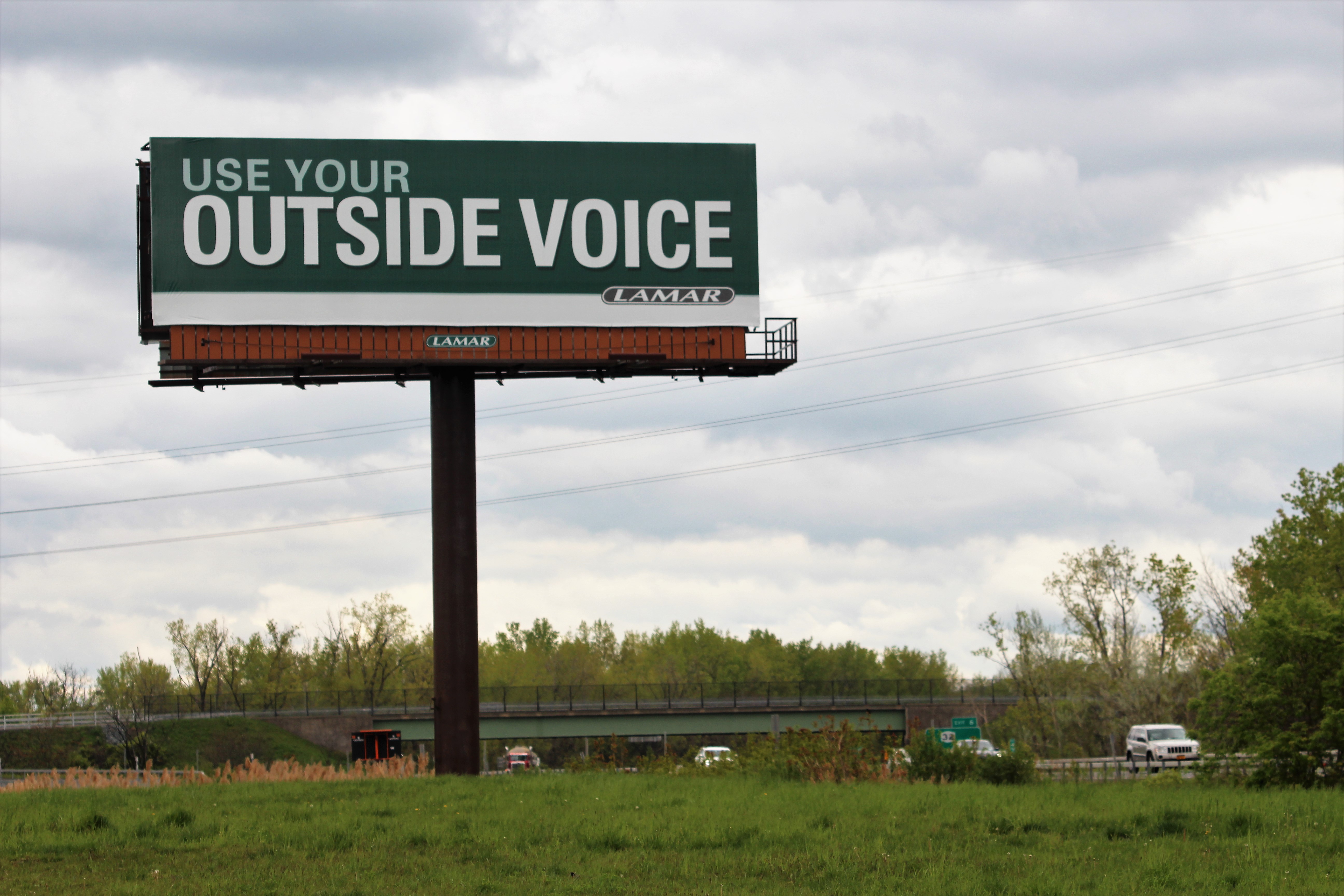
Signage Readability Under Real Lighting: A Practical Guide for Venue Ads
Signage Readability Under Real Lighting: A Practical Guide for Venue Ads

Good-looking signage fails in the easiest way possible: it looks sharp on a screen and turns into decorative noise on the street. That is not a mystery. It is a reading problem. Distance, glare, motion, and bad contrast do the damage. The fix is not more style. It is fewer lies in the layout.
If you want the broad studio context behind that, start with the home page, then review the services and portfolio pages for the kind of venue work this studio handles. If you need help turning a weak sign into something legible, use the contact page. Background on the team is on the about page.
Why readability fails in the real world
Most signage is judged under the wrong conditions. Designers proof it close up, under even light, with no movement. Real viewers stand across a street, walk past it, glance at it through glass, or see it half-lit by sun and half-lit by a ceiling lamp. That is the actual test. Everything else is theater.
- Distance shrinks detail faster than people expect.
- Glare and reflections wash out thin type and pale contrast.
- Motion reduces reading time to a glance, not a careful scan.
- Mixed lighting makes one color pair behave differently from one hour to the next.
For a plain-language primer on contrast and legibility basics, the WCAG contrast guidance is a useful reference, even if you are not building a website. It explains the same problem in a more formal way: if contrast is weak, reading slows down or fails.
Start with viewing distance
Do not choose typography first. Choose distance first. Where will the viewer stand, sit, queue, or drive? A banner seen from 5 meters has a different job from one seen at 20 meters. If you cannot name the distance, you are guessing. Guessing is how pretty signs become useless signs.
| Likely viewing distance | What it means | What to do |
|---|---|---|
| 3-5 m | Short glance, often walking | Keep the message short and the type heavy enough to survive motion. |
| 5-10 m | Typical venue approach distance | Use one strong headline, one support line, and clear spacing. |
| 10-20 m | Street or parking-lot read | Increase size, simplify copy, and cut decorative detail. |
A practical rule: if the main message cannot be read in a quick mockup from the expected viewing distance, it is too small or too crowded. This is not subtle. It is basic physics with a branding costume on.
Contrast first
Color contrast is not decoration. It is the mechanism. Dark text on a light field usually beats clever color pairing, especially outdoors. Grey-on-grey looks tasteful in a mockup and timid in daylight. Venue signs are not mood boards.
- Daylight: prefer high-contrast pairings that do not depend on subtle saturation differences.
- Indoor lighting: check for warm bulbs, uneven pools of light, and dark corners that swallow fine type.
- Night visibility: assume the sign will lose contrast before it gains drama.
Do not trust your screen. Check the design under dimmer light, bright light, and angled light. If the message collapses in any of those, the sign is fragile.
For a practical contrast reference, use the WCAG contrast guidance. It is not a magic shield, but it does stop some avoidable mistakes.
Typography essentials
Decorative fonts are where readability goes to die with style. Use them only when the message is short and the display distance is forgiving. Otherwise, pick a clean face with enough weight to survive print, glare, and movement.
- Weight: medium to bold usually survives better than thin or ultra-light styles.
- Spacing: give letters room, but do not stretch them into a weak, airy disaster.
- Line length: short lines read faster; long lines make viewers work harder than they should.
- Case: mixed case is often easier to parse than shouting in all caps.
Use decorative type where it earns its keep: maybe a headline accent, never the whole sign. If the font has personality but the message disappears, the font has failed its one job.
Hierarchy that works at a glance
A venue sign needs a single dominant message. Not three. Not “a little bit of everything.” One primary action, one supporting line, and one contact cue if needed. Anything else is clutter pretending to be marketing.
Use this order:
- Headline: the thing people should notice first.
- Subhead: the short support line that explains the headline.
- CTA: the action, such as visit, reserve, enter, or call.
In practical terms, the headline should win from a distance, the subhead should survive a half-glance, and the CTA should be obvious without hunting. If the reader has to assemble the meaning, you designed a puzzle instead of signage.
Background and effects
Solid blocks of color often outperform busy backgrounds because they reduce visual friction. Outlines and shadows can help, but only when they support legibility instead of pretending to be style.
- Solid blocks: best when the background is noisy or the light is unpredictable.
- Outlines: useful when text crosses a photo or textured field.
- Drop shadows: only if they are subtle and actually separate text from the background.
Avoid placing essential text over a detailed image unless the image has been controlled hard. If the photo has drama, the text should not have to compete with it.
Material considerations
Material changes visibility. Mesh, vinyl, laminated finishes, and glossy surfaces all behave differently once they leave the screen and meet the sun.
- Vinyl or mesh: useful for large-format venue ads, but test for viewing-distance loss and texture interference.
- Glossy finishes: can catch reflections and flatten contrast in strong light.
- Matte finishes: often reduce glare and keep type more stable under mixed lighting.
The material does not rescue weak design. It only changes the damage. Choose it with the lighting and placement in mind, not because it sounded nice in a sales call.
Night and day versions
If the same venue sign must work during the day and at night, assume the conditions are different enough to justify two layouts. At night, contrast often needs to be louder, not prettier. In daylight, reflections and ambient brightness are the main enemies. In the evening, the issue is usually low contrast and weak emphasis.
- Use stronger text-to-background contrast for evening visibility.
- Reduce secondary copy if lighting gets uneven.
- Simplify the layout if the sign is backlit, partially shadowed, or viewed from a moving street.
Do not let a single “universal” mockup talk you out of basic reality. Day and night are not the same test.
Quick self-check checklist before print or install
Run the boring checks before you spend money on a sign that lies from three meters away.
- View the mockup at 5 m, 10 m, and 20 m.
- Squint at it until the details blur. What still reads?
- Do a 30-second read test: can someone say the main message back after one glance?
- Check the sign under bright light, low light, and angled light.
- Make sure the hierarchy is obvious: headline first, support second, CTA last.
- Remove any copy that does not help the viewer act.
- Confirm the material choice matches the actual installation environment.
If the sign passes only when examined politely, it fails.
The blunt rule
Design venue signage for the worst reasonable viewing condition, not the best case in your notebook. If it survives glare, distance, and motion, you have a sign. If it only survives admiration, you have a problem.
When you need help turning that into a usable layout, a clean brief is better than optimism. Start with the real site, the real distance, and the real light. The rest is just decoration with a budget.