Understanding Venue Advertising: Key Elements to Consider
Venue advertising doesn’t fail because “marketing is hard.” It fails because the basics are ignored.
Here are the questions most venue teams end up asking after the print proofs arrive, the banner is installed, and everyone pretends the confusion is normal:
- Will this signage read at the actual viewing distance?
- Did we send the right files (dimensions, bleed, formats) the first time?
- Does the message hierarchy match how people actually decide on-site?
- Where does the “next step” (tickets, calls, QR) go?
According to research on effective communication and information design, clarity and legibility are not “nice to have”-they directly affect comprehension under real-world viewing constraints. For practical guidance on web typography and readability, see Web Accessibility Initiative: Typography & readability guidance (general principles apply to signage design as well) and Nielsen Norman Group on reading speed. Both are good reminders that busy environments punish weak hierarchy.
By the end of this guide, you’ll understand the key elements that make venue ads effective, how to tailor them to specific locations, and which mistakes reliably cause reprints or wasted placements.
Table of contents
- Defining venue advertising
- Key components: location, material, and design
- How to tailor ads for specific venues
- Real-world examples of effective venue ads
- Common pitfalls to avoid
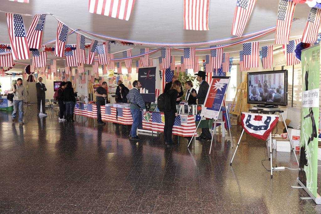
Defining venue advertising
Venue advertising is promotional material designed to influence decisions on-site or near the place of action-for example, where people arrive, queue, enter, park, or pass by.
Compared to online ads, venue ads are judged fast. People don’t “browse”-they skim. Your job is to reduce the decision to a few seconds: what is it, why care, and what to do next.
Key components: location, material, and design
1) Location (where the viewer actually is)
- Sightlines: where are eyes when they’re walking, waiting, or entering?
- Viewing distance: banners read one way at 5-10 meters and another way at 30+ meters.
- Lighting: indoor diffuse light vs outdoor glare changes contrast requirements.
- Background clutter: posters on reflective walls or busy doors will require stronger separation.
2) Material (what survives the environment)
Material isn’t only “durability.” It affects color consistency, texture, and how text holds up after handling.
- Indoor signage: paper, vinyl, or lightweight boards can work-if humidity and touch points are controlled.
- Outdoor signage: consider weather resistance, lamination, and how inks behave under sun exposure.
- Mounting behavior: choose finishes that tolerate grommets, hems, or mounting hardware without distortion.
3) Design (message hierarchy + legibility)
- Headline first: the main claim must be visible before the rest.
- One benefit, not five: reduce competing promises.
- Proof that fits: dates, featured acts, capacity, or a simple “what you get” line.
- CTA in plain language: “Buy tickets,” “Reserve a table,” or “Call now” beats clever wording.
- Typography contrast: dark text on light backgrounds, or the reverse-without mid-tone mush.
- QR discipline: don’t treat QR as decoration; pair it with a reason to scan.
How to tailor ads for specific venues
If you treat every venue like a generic template, you’ll eventually meet the “why is it unreadable here?” problem.
Step 1: Map the journey (arrival → decision)
List the moment-by-moment behaviors:
- Where do people arrive?
- Where do they pause (queue, entrance, ticket desk)?
- Where do they transition (hallway turns, parking exit)?
- Where can you place a next-step action without blocking flow?
Step 2: Match format to function
- Banners: strong for directional visibility and long-arc sightlines.
- Posters/flyers: work where people stop and look closer.
- Brochures: used when the offer needs explanation beyond a headline.
- Floor plan renderings: only when multiple stakeholders need to align on placement zones.
Step 3: Pre-decide the CTA
Before you design, pick one primary action:
- Tickets/reservations
- A phone call
- A website/landing page
- A location/address confirmation
Then ensure the landing page (or call script) actually matches what the ad promised.
Real-world examples of effective venue ads
These aren’t “guaranteed to win” stories. They’re recognizable patterns you can audit in your own venue.
Example A: Entrance signage that confirms the offer in 3 seconds
Effective entrance ads usually combine:
- a clear event/offer name
- a date/time line
- a single next step (tickets / reservation)
- contact/website support
Everything else is optional because most people decide before they read.
Example B: Queue-area posters with “scan now” discipline
In queue zones, posters can afford more text. The best versions typically:
- teach the value (“what changes if you book now?”)
- place the QR next to a reason to scan
- keep the phone/website consistent across all placements
Example C: Outdoor wayfinding banners with contrast tuned for daylight
Outdoor banners succeed when:
- color contrast remains strong at the expected time of day
- type is bold enough for distance
- headline-to-CTA spacing supports fast scanning
Common pitfalls to avoid
- Unclear viewing distance: if you don’t define it, designers guess-and guesses fail.
- Too many competing messages: “brand + offer + partners + mission + fine print” rarely works outdoors.
- Weak contrast: if it looks readable on a monitor, it may still collapse in glare.
- Missing next step: people can admire banners while still doing nothing.
- Last-minute copy changes: they destroy timelines and push reprints.
- Inconsistent branding across formats: logos, colors, and wording drift between banner and flyers.
If you want to move faster, start with what your venue will punish. Ask the boring diagnostic question: “From 10-30 meters (and in the actual lighting), what can someone read in 3 seconds?”
Key takeaways
- Venue ads are location-first: map sightlines and pause points.
- Material is functional: choose finishes that survive handling and environment.
- Design is hierarchy: headline → benefit → proof → CTA.
- Tailor format to function: banners vs flyers vs brochures.
- Audit pitfalls: contrast, clutter, missing CTA, and timeline chaos.
For more on how advertising projects are structured, explore our services and browse examples in the portfolio.
Need to plan a new banner or print set? A clean starting point is defining the use case, dimensions, materials, and review steps before artwork goes out.